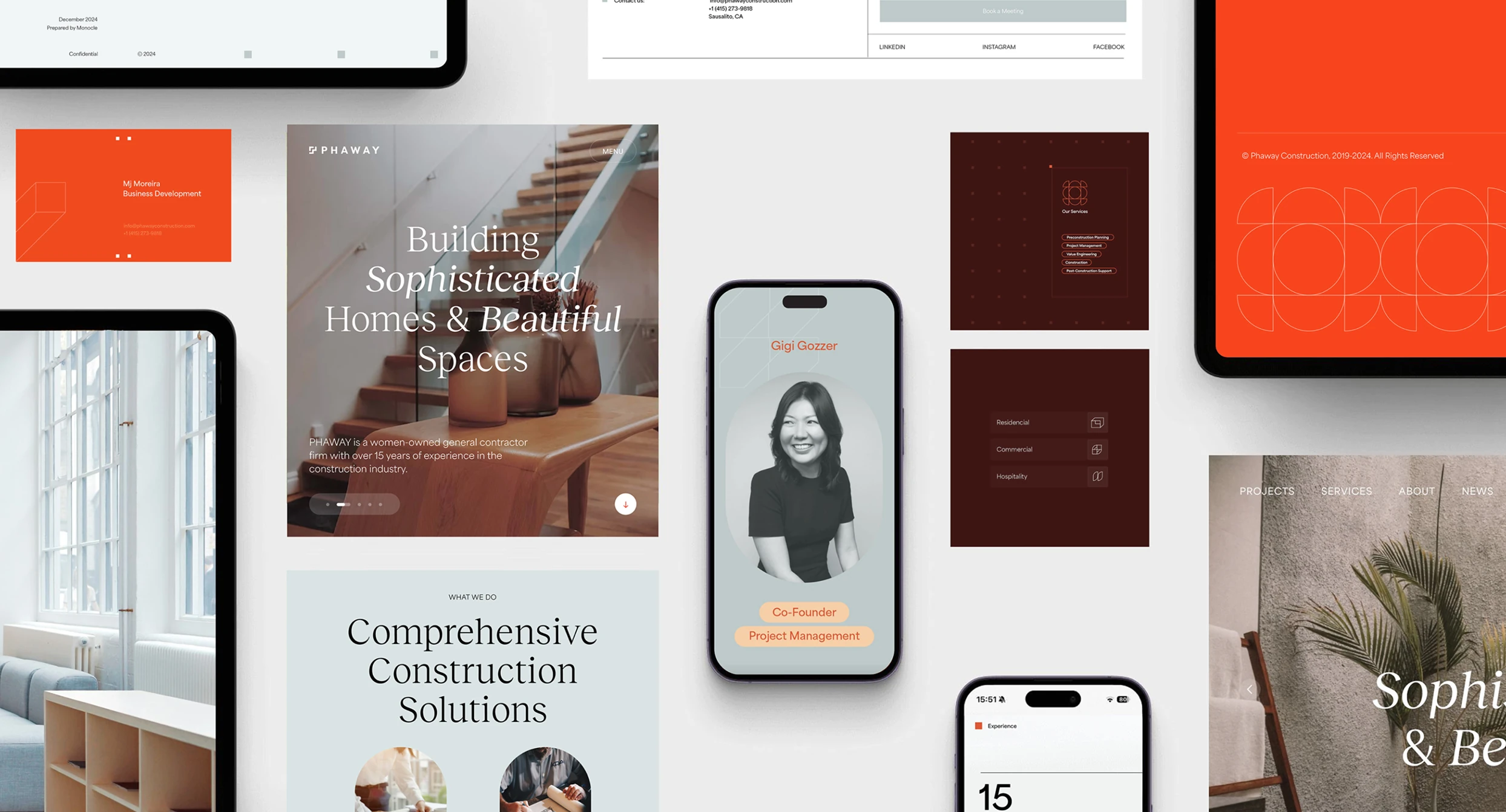
Phaway Construction
A ground-up brand and website redesign for a Peruvian-rooted, woman-led construction firm — where the site's job was to prove taste, craft, and trust before a single conversation began.
Construction is bought on faith. A client hands over money, property, and months of their life to a crew they've never met — and mostly decides who to trust from a screen. Phaway needed its site to do what a handshake usually does: earn trust before the first meeting.
The old site undersold the firm. The building work was excellent; the presentation of it wasn't. Prospects couldn't tell what Phaway — a woman-led, Peruvian-rooted firm with 15-plus years across residential and commercial work — was actually capable of, or find an obvious way in. Fair or not, a rough site reads as a rough contractor. And a builder's website is itself a build: the first finished thing a prospect sees, so they read its craft as a preview of yours.
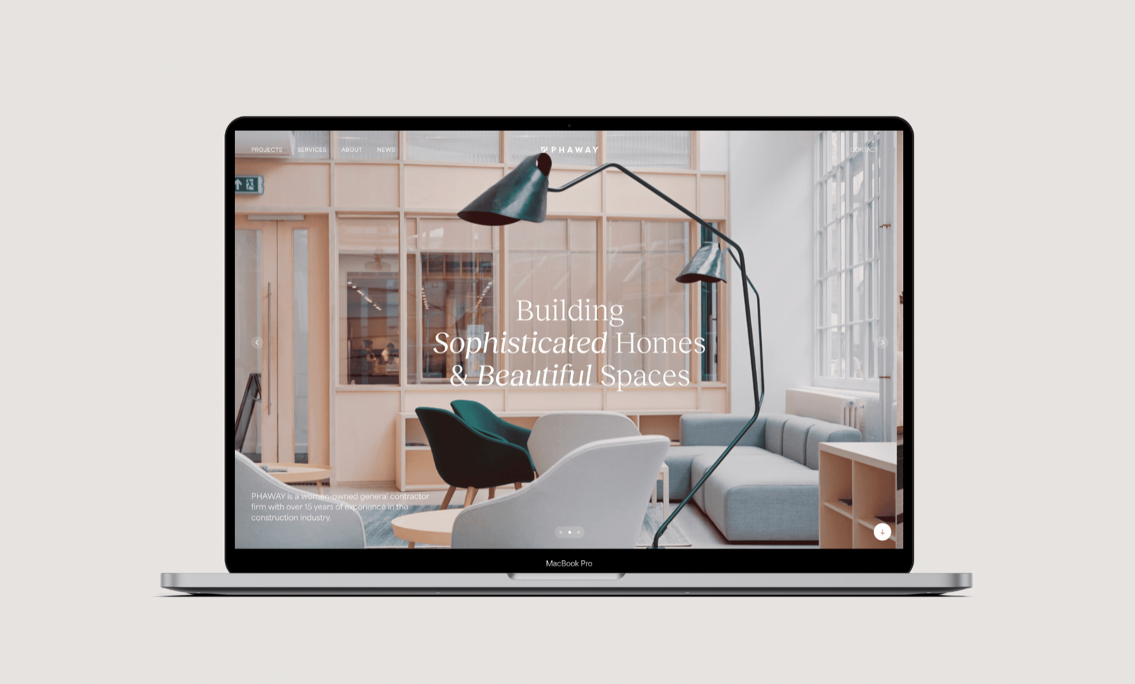
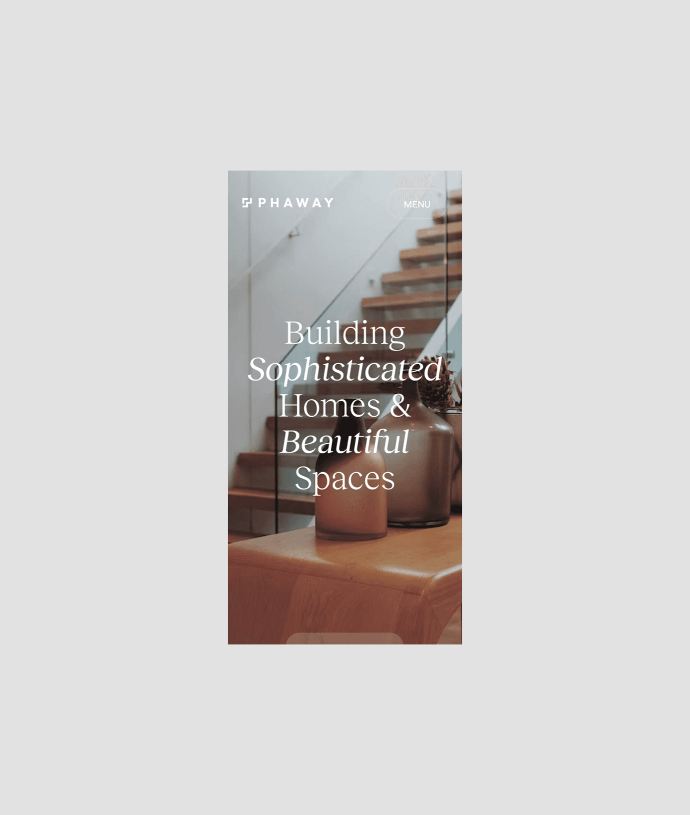
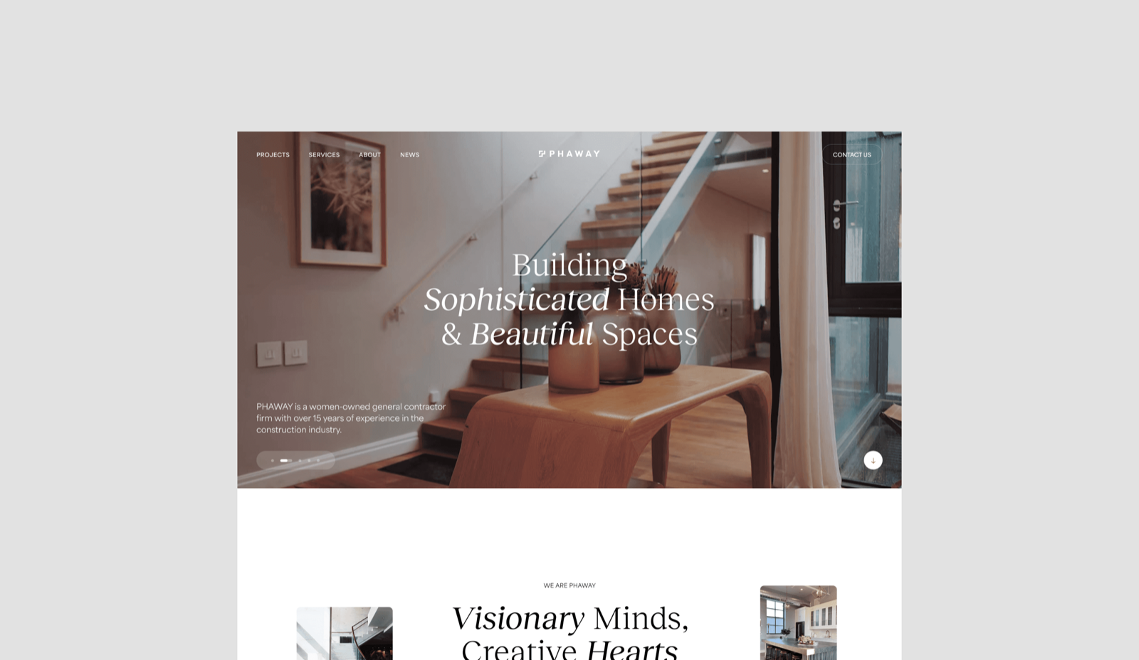
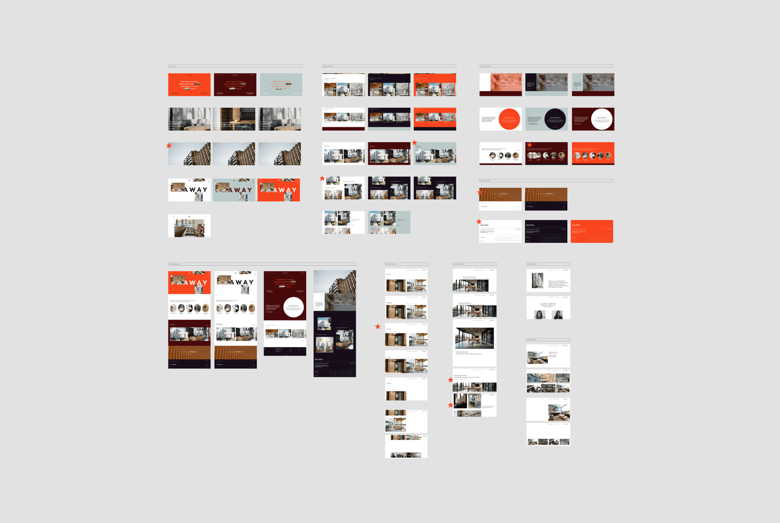
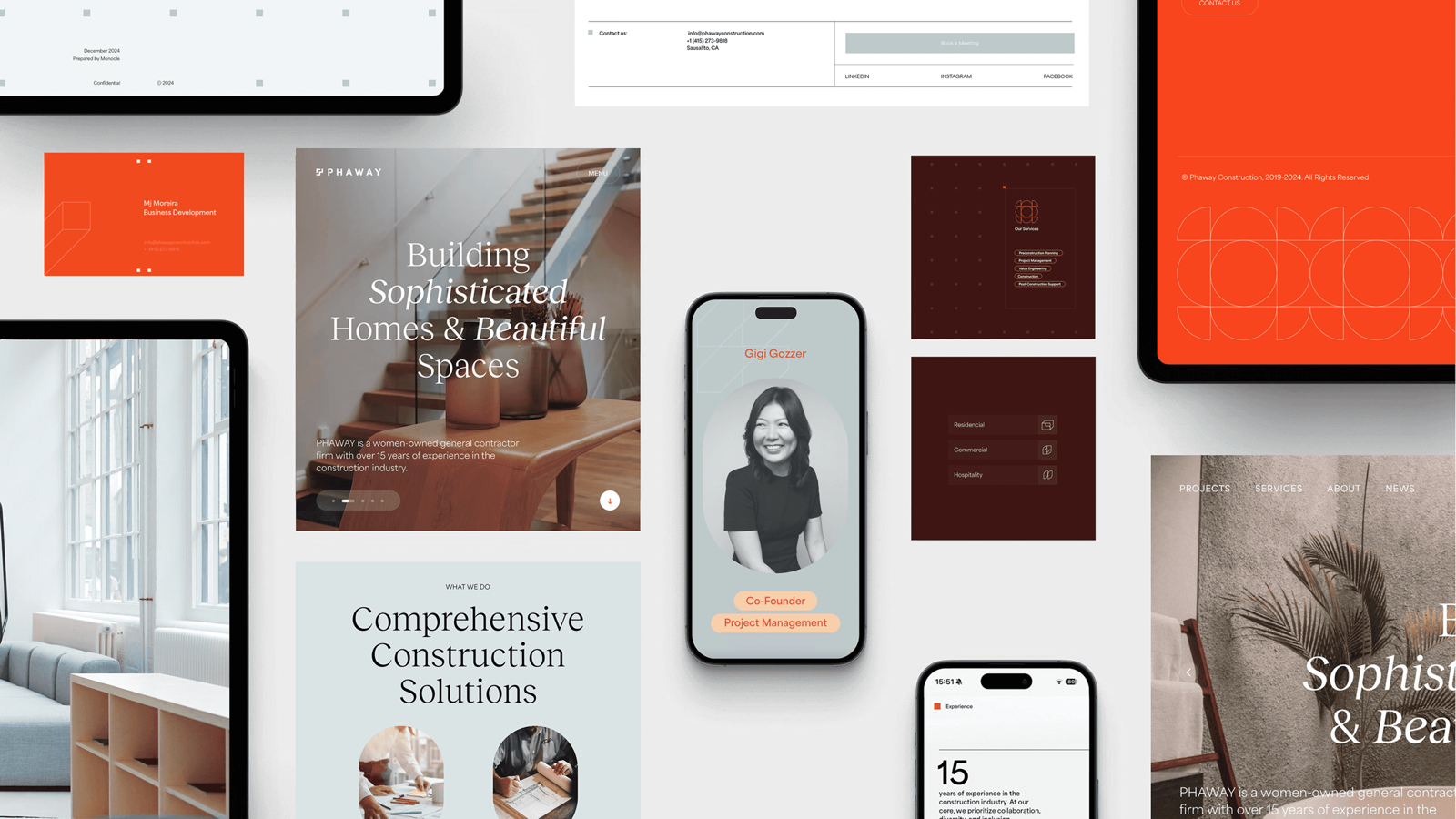
The homepage across frames — tuned to perform competence, not describe it.
The site had to be a work sample
That idea drove three decisions — the spine of the build. I led design and, on this one, built the site too, sharing creative direction with brand designer Jessie Laura.
Prove it visually
The site is the argument, so it had to survive the same scrutiny the firm's work does — type, spacing, photography, and motion tuned to perform competence, not describe it. The sharper call was the brand direction: we passed on generic “professional contractor” language for warm earth tones and architectural motifs drawn from the founder's Peruvian roots. That's a real risk — lean too warm and a commercial buyer reads boutique, not builder — so the heritage lives in palette and texture, never as a story bolted on top. Written up as one brand manual, the system carries across site, deck, and press, so new assets ship without rebuilding the look each time (27% faster), and the deck in that same identity drove 52% stronger pitch engagement.
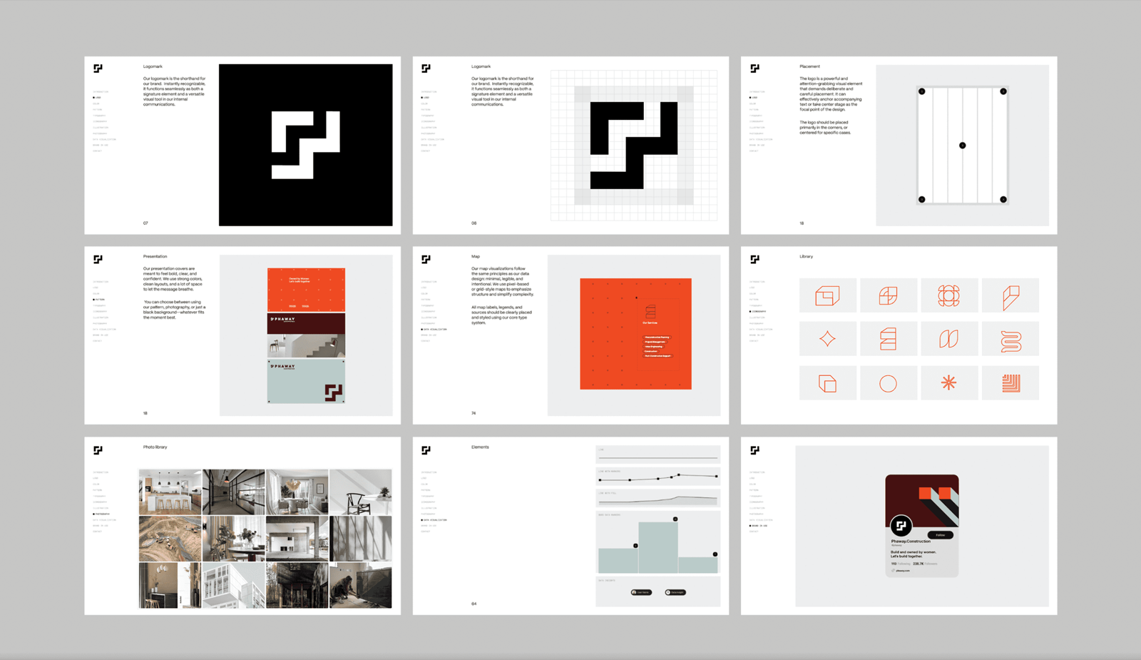
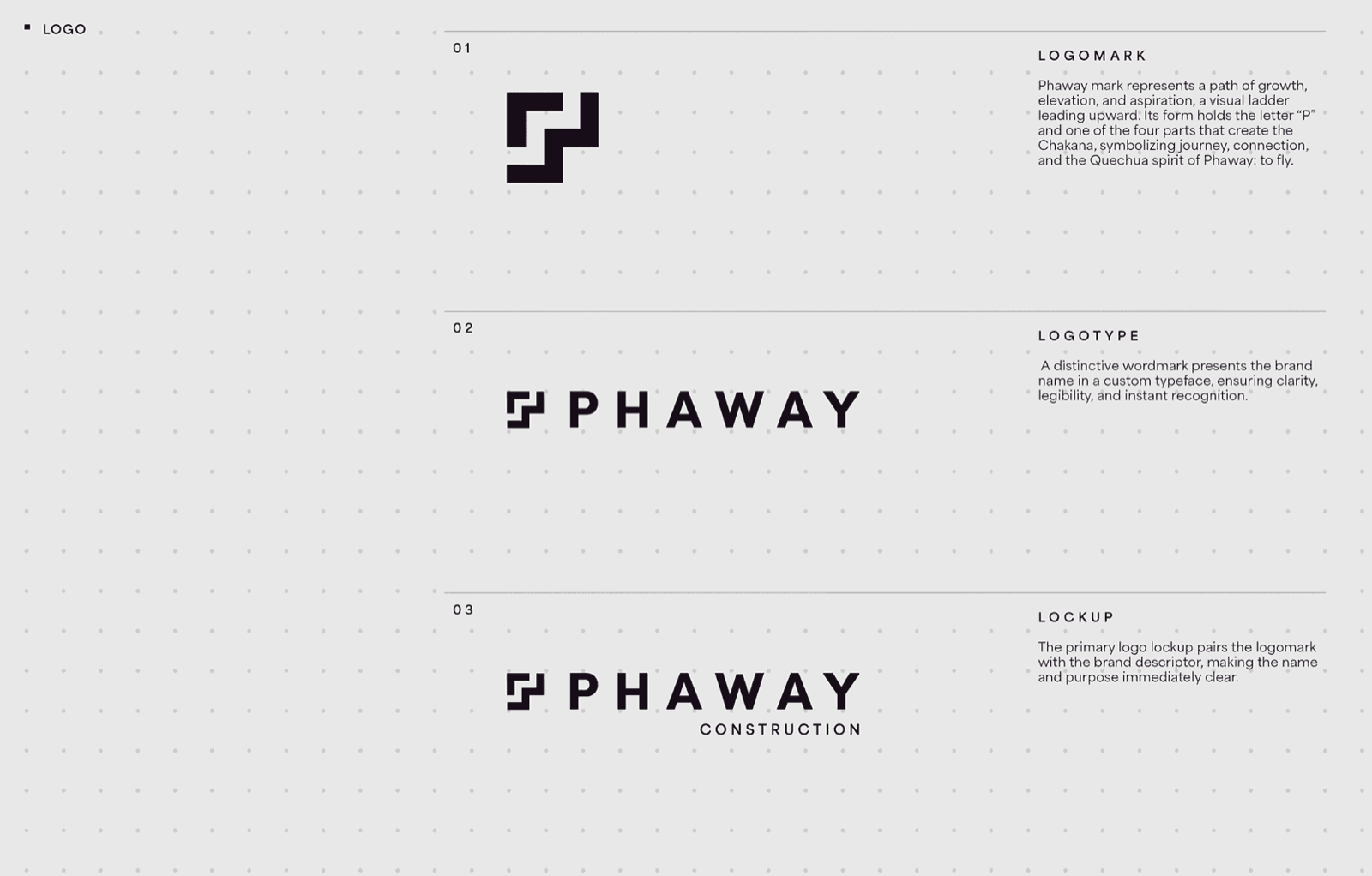
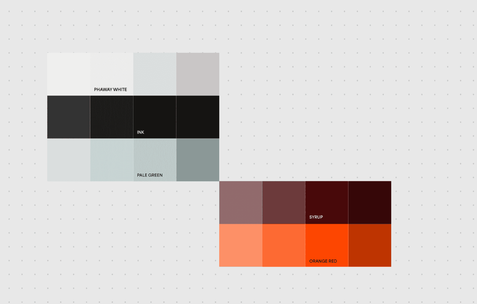
The identity — logomark, logotype, and a warm, heritage-rooted palette drawn from the founder's Peruvian roots.
Show the range without looking unfocused
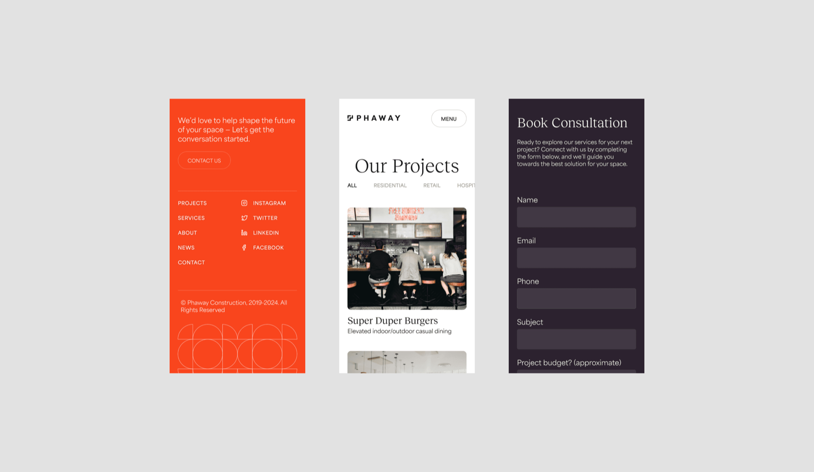
Phaway does polished residential work and commercial jobs — like the dining-space transformation for Super Duper Burgers, an indoor/outdoor concept built to lift the whole experience. Shown flat, that breadth can read as a firm without a lane. We thought about narrowing the story to one thing. Instead the Our Projects page leads with categories and filters — which costs something: it hands the sorting to the visitor instead of telling them in one line what Phaway simply is. I accepted losing the browser who wants to be told, betting that a high-consideration buyer who wants range will do the steering — and find a firm that can actually deliver it.
Make starting a project feel simple
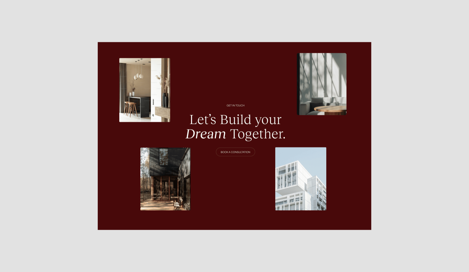
Turning interest into a conversation could've been a form in the footer — one click, no commitment. We gave it its own page instead. That has a cost: visiting a Book Consultation page is a decision, where a footer field is a reflex, so some casual clicks never convert. But a construction buyer wants a considered intake, not a frictionless one — a little deliberate weight reads as seriousness on both sides. It paid off: qualified inquiries rose 38%. The least glamorous screen in the build, and the whole reason the site exists.
Impact
Each number tracks a decision: a dedicated Book Consultation page lifted qualified inquiries 38%; the deck in the same identity drove 52% stronger pitch engagement; and one documented brand manual made assets ship 27% faster.
Design has to carry proof, not just information
For any high-consideration service, the website isn't an information layer wrapped around the real work — it is a sample of the work, and clients grade it as one. This usually gets framed as a SaaS problem, but a builder asking you to trust them with a house has a harder gap to close than most software ever faces, and far fewer conversations to close it in. Design that carries proof, not just information, is how you win the meeting before the phone rings.
Phaway Construction case study