
LetsTalk
Redesigning LetsTalk.com's shopping experience for a category where every “product” is actually five interdependent decisions.
LetsTalk hired me to redesign the store. The evaluation I ran said the store wasn't the problem.
A heuristic pass against Nielsen's ten turned up the usual suspects — discovery was hard, the comparison tools too thin to support a confident choice, hierarchy burying what mattered. But the pattern underneath pointed somewhere bigger. People weren't failing to find a phone. They were failing to assemble a working one — device, carrier plan, pricing, and activation, each depending on the other three, and the site presenting every choice as if it stood alone. This was never a selection problem; it was a configuration problem wearing a catalog's clothes.
So I stopped designing a better catalog and started designing the configuration. That moved the whole project's center of gravity: the compatibility logic and a real comparison tool became the product, and the merchandising polish everyone pictures when they hear “store redesign” moved to the background. The cost was that the biggest wins would live under the hood — structural, hard to screenshot, harder to sell than a prettier homepage. I took the trade, because the prettier homepage would've solved a problem the business didn't have.

And it had to do all of that twice
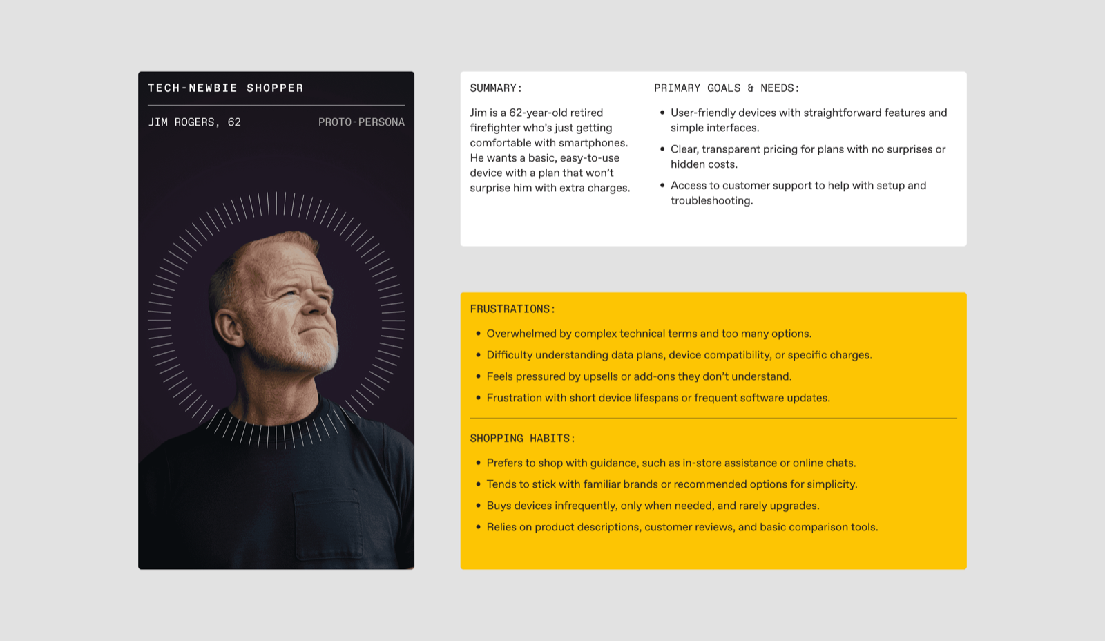
The reframe came with a complication the catalog framing hid: the same storefront served two buyers with nothing in common but a URL. Jim Rogers, replacing a personal phone, needs every term explained and as little jargon as possible. Lisa Martinez, a corporate IT manager running wireless across an organization, wants control and fleet tooling, not hand-holding. Three more sat between them — a spec-hungry consumer, a price-optimizer, a small-business owner. Five proto-personas, and the distance from Jim to Lisa was the whole problem in a line: serve one well and you usually insult the other.
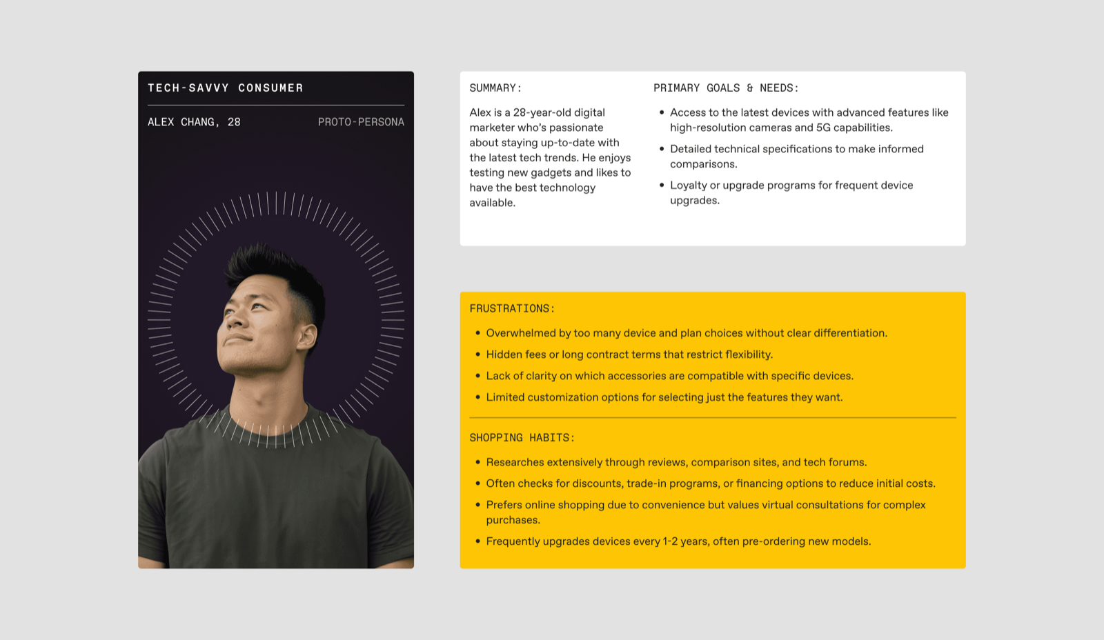
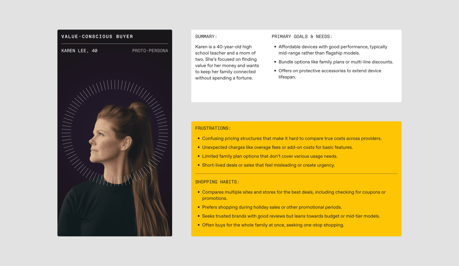
Five proto-personas — spec-hungry to price-conscious…
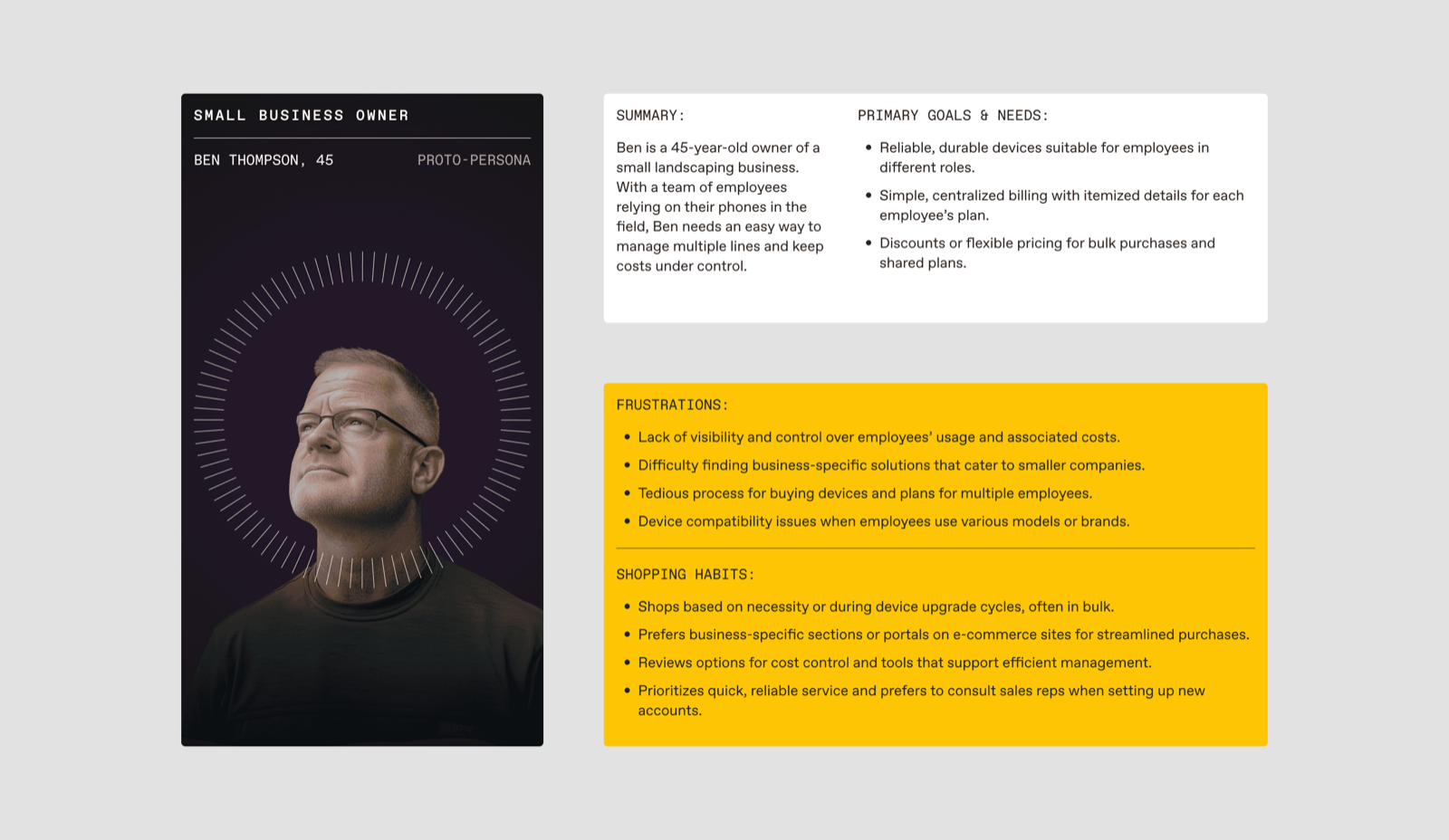
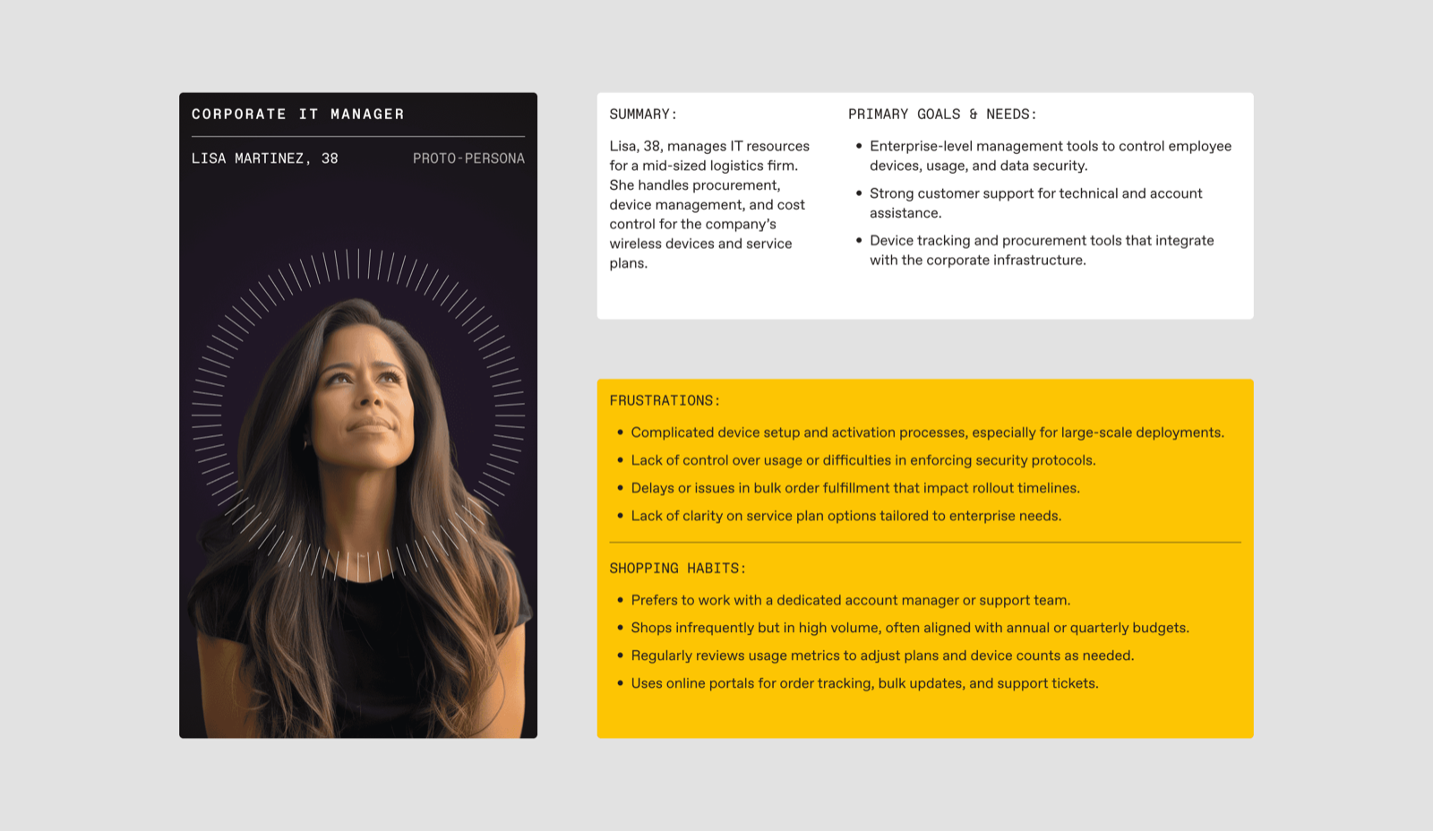
…through small-business and enterprise buyers…
Three decisions carried the build
Each had an obvious version I turned down — and naming what I gave up is the honest way to show why the harder path was right.
Split the funnel, without making either buyer feel second
One generic path is the cheapest IA to ship — and it drowns Jim in enterprise options while making Lisa wade through consumer hand-holding. A walled-off B2B portal fixes that and creates a worse problem: it doubles the site and orphans the support, FAQs, and service both audiences share. I built tailored consumer and corporate sections over a shared spine. The cost is duplication — two front doors to design and maintain — and I paid it, because making either buyer the afterthought was the more expensive mistake.
Hide the machinery, don't teach it
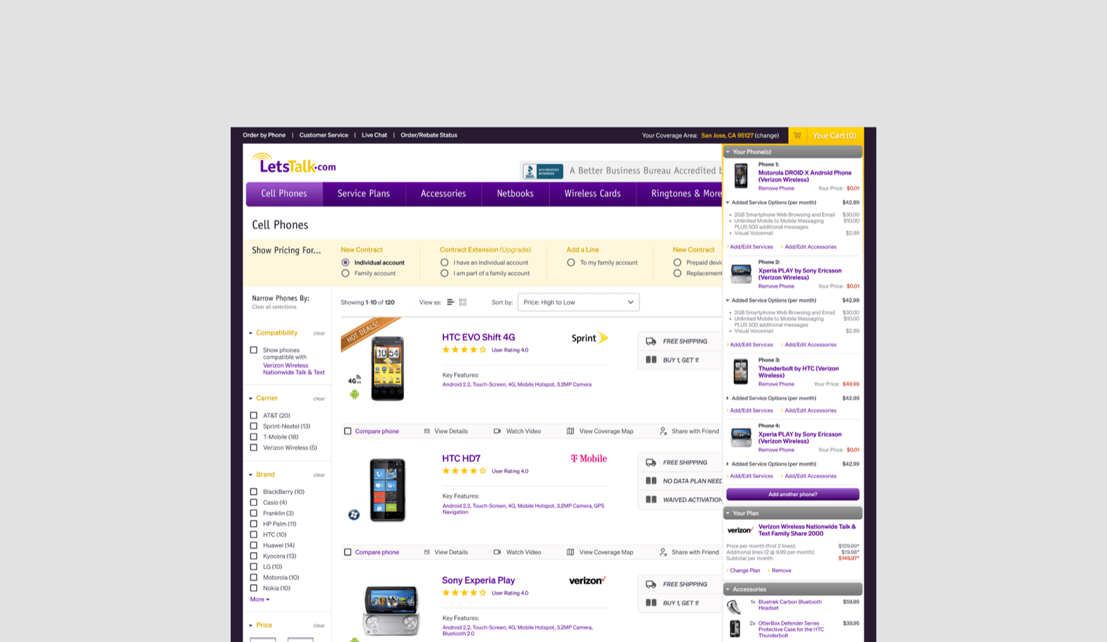
Device, plan, carrier, pricing, and activation all interlock, and the flattering move is to expose that matrix and let people reason across it — more control, exactly what Lisa would ask for. But exposing the machinery turns a phone purchase into homework, and punishes Jim to impress Lisa. I bet the other way: surface only valid combinations and let the system enforce compatibility silently, so a good decision never required understanding the rules behind it. The cost lands on the power user — Lisa can't override the rails. For a storefront whose whole job was to make interdependence feel simple, that was the right buyer to disappoint.
Split filtering from comparison — they're two jobs
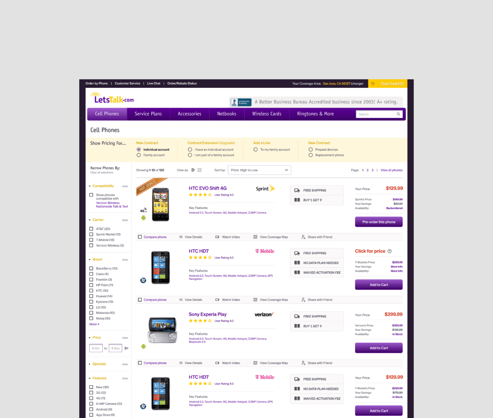
The impressive-looking option is one faceted mega-grid that filters and compares at once, asking the shopper to narrow and decide in the same overloaded moment. I separated them: clean filters (type, features, brand, price) to narrow the field, then a distinct comparison tool to weigh finalists on specs, plan compatibility, and price. The cost is an extra step. I bet two clear moments beat one crowded one — a buyer mid-configuration needs the decision protected from the noise of the search.
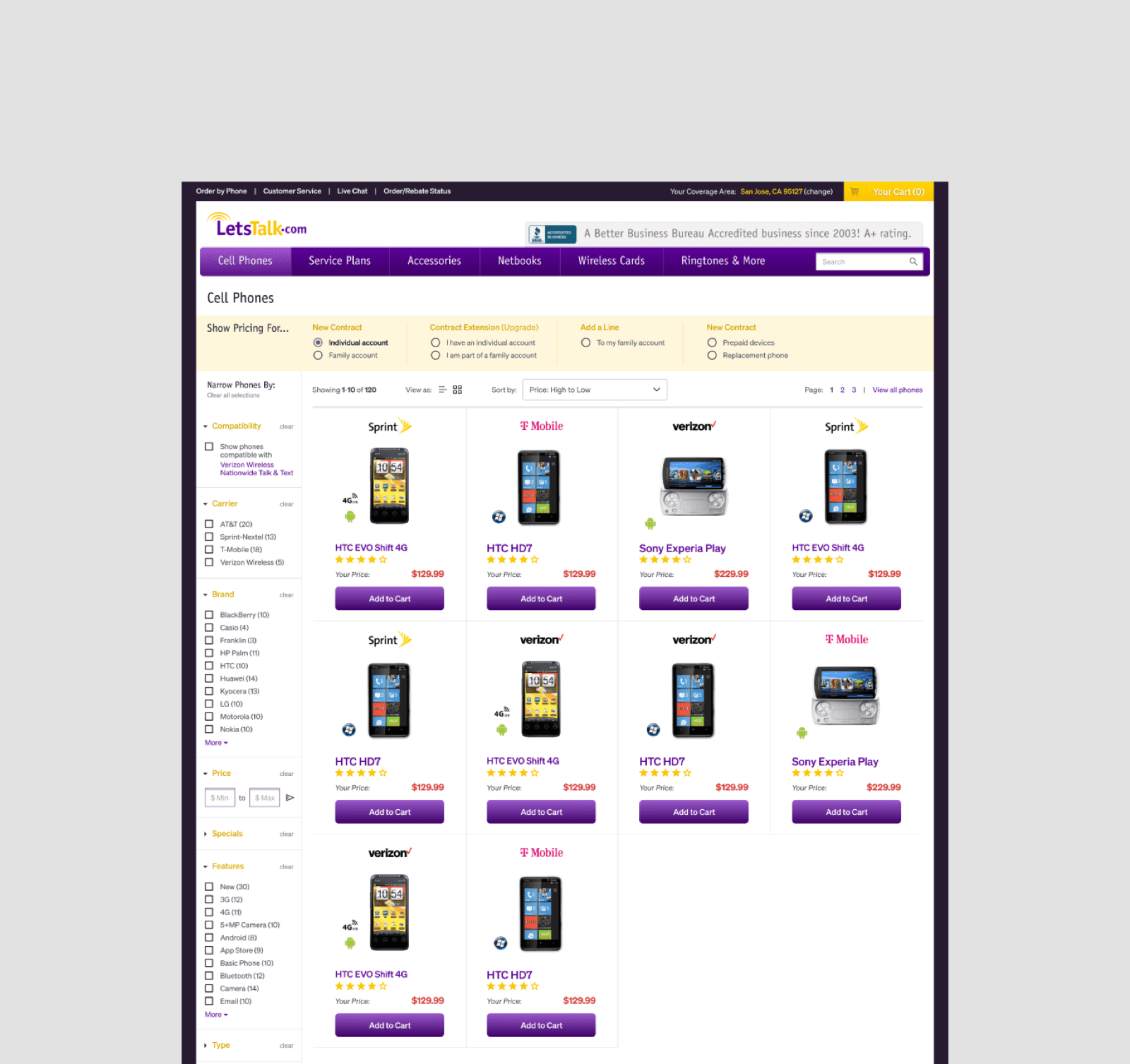
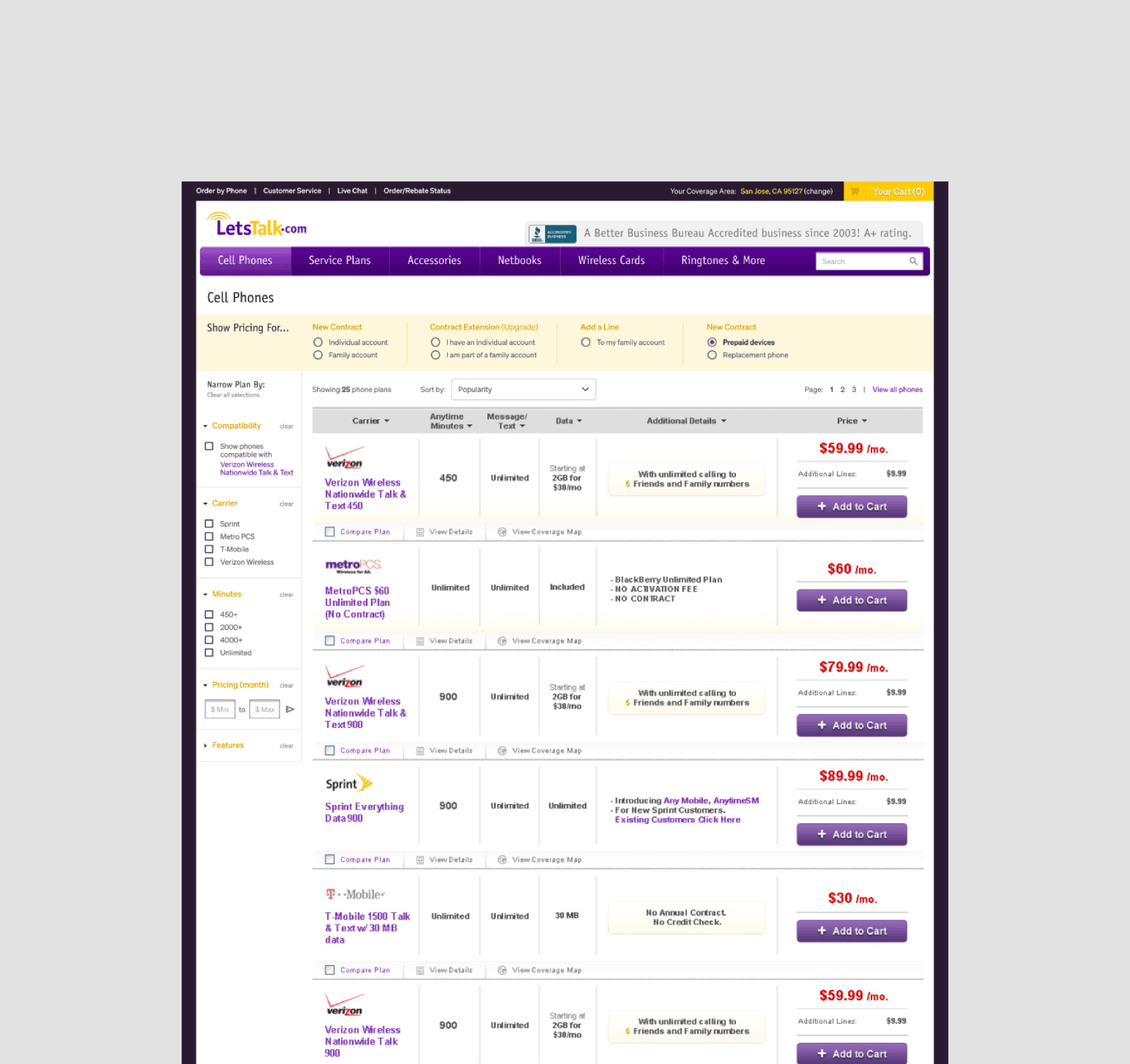
Two clean moments instead of one crowded one — filter to narrow, then compare finalists side by side.
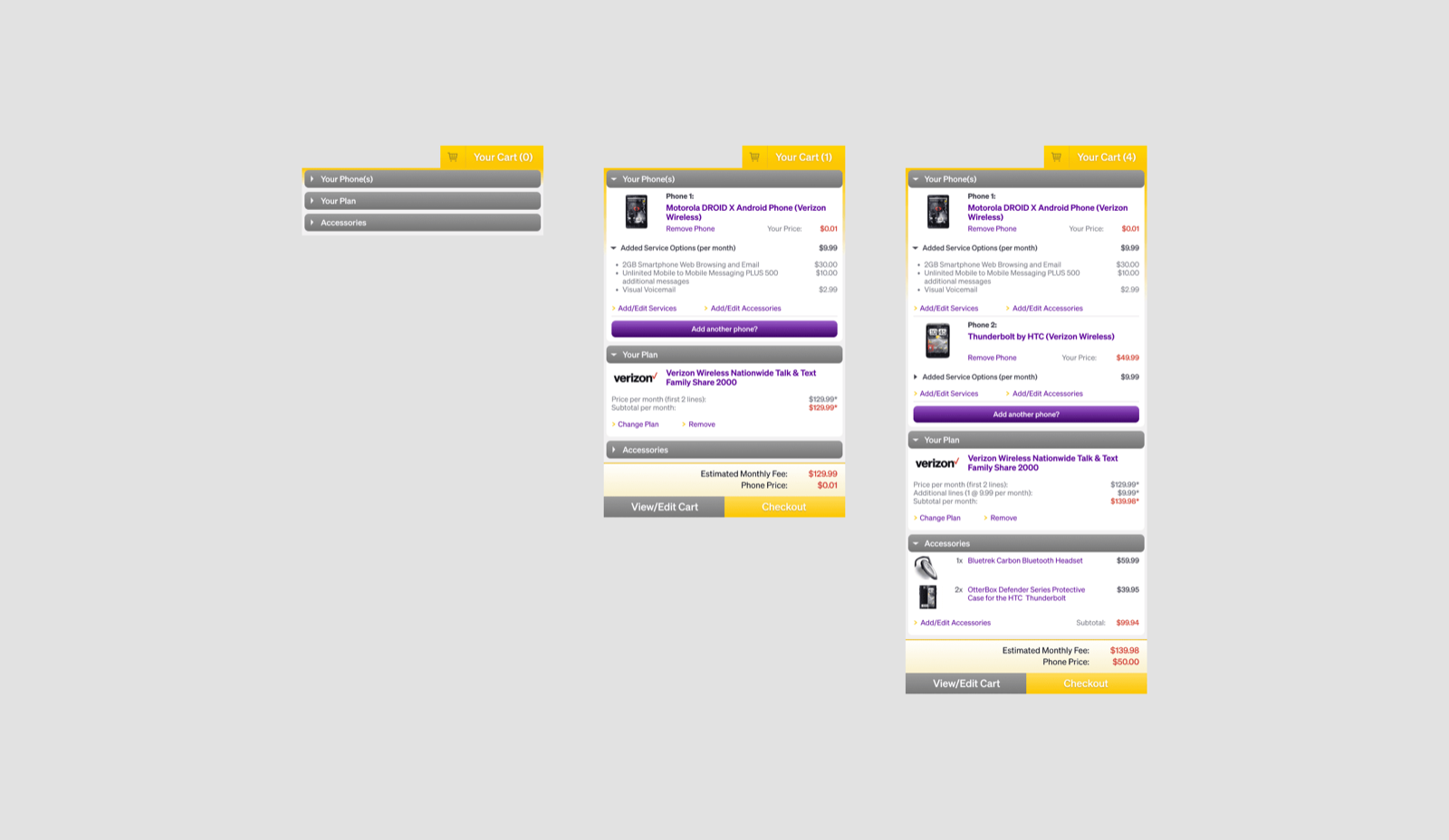
Two smaller bets, each with a bill
The cart became four states, not one — a hover preview, an empty state that recommends instead of scolds, an item-added confirmation with a clear next step, and a persistent tally in the corner. In a flow with this many moving parts, orientation is the cart's real job; the cost was four times the design, and the discipline to keep each state doing one thing. And the brand had to hold past the transaction. A generic identity undercuts a store asking to be trusted with contracts and activations, so we refreshed the logo, palette, and type into a documented system and carried it into marketing and PhoneTalk, the content arm. That's scope well outside a storefront redesign — worth it, because in this category trust is bought before the cart.

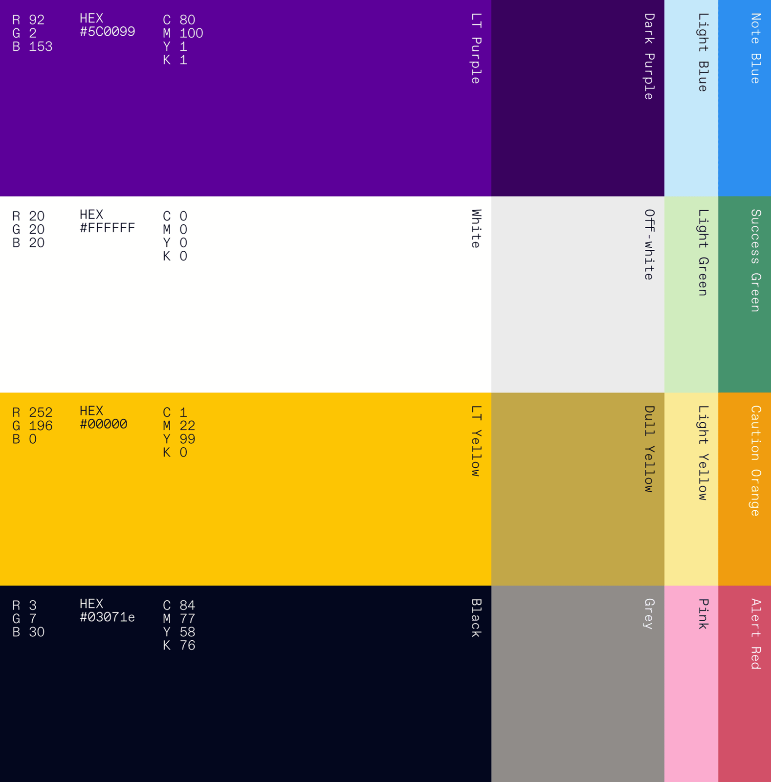

A documented system — palette and mark — built to look like it could hold the complexity underneath it.


PhoneTalk — where the brand held past the transaction.
Impact
Each number tracks a decision, measured against the old experience: hiding the compatibility drove the pairing-accuracy gain; the split funnel and a protected comparison drove completed purchases; separating filtering from comparison made the path faster.
What I'd do differently
Pressure-test the enterprise path with real IT managers. These were proto-personas — sharp assumptions, not researched people. I committed a whole corporate path to the belief that Lisa wants control and fleet tooling; I'd validate that with actual buyers before building an IA around it.
Instrument the configuration, not just the conversion. The interesting failures in a bundle live between the steps — where a plan choice invalidates a device, where activation stalls a cart. I'd measure inside the bundle, not only at checkout.
Lead with the reframe out loud, on day one. Moving from “redesign the store” to “this is a configuration problem” was the most valuable thing I brought — and I let the work reveal it instead of naming it in the first meeting. Said up front, the reframe aligns scope and sets the metrics; discovered quietly, it has to be re-won at every step.
Some shopping problems are configuration problems in disguise
The tell is when every choice on the page depends on four others. When that's true, showing more information is exactly the wrong instinct — the job is to let very different people make interdependent choices without ever having to understand the system generating the dependencies. The buyer configures; the storefront carries the compatibility. Get that division of labor right and it turns out the catalog was never the product. The configuration was.
LetsTalk case study