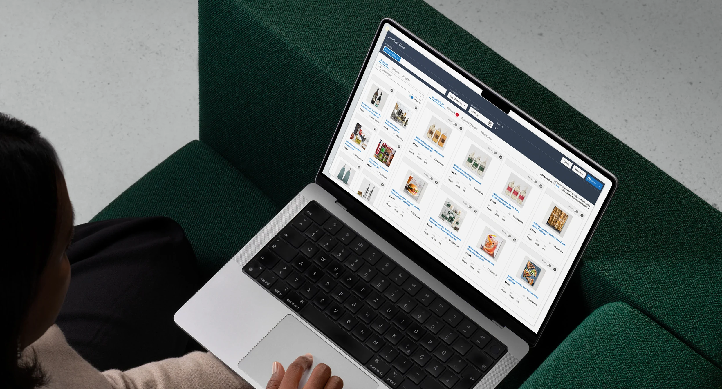
Bloomreach Grid Editor
Redesigning Bloomreach's Product Grid Editor so ranking logic, visual merchandising, content placement, and real-time preview lived in one operational workspace — an interface where algorithmic ranking and human merchandising judgment could work together.
Bloomreach's search engine could rank and personalize thousands of products automatically. But ecommerce teams still needed to intervene. Campaigns change. Inventory moves. New products launch. Business priorities shift. Sometimes the product a merchandiser needs to promote isn't even part of the result set the algorithm would naturally return.
The challenge wasn't replacing automation with manual control. It was creating an interface where algorithmic ranking and human merchandising judgment could work together. I led the redesign of the Product Grid Editor, bringing ranking logic, visual merchandising, content placement, and real-time preview into one operational workspace.
One page. Three different systems.
Before Product Grid Editor, building a single merchandising experience meant working across three separate legacy environments.
Ranking Rules
The engine-level tool was largely text driven. Merchandisers created conditional rules — if Brand = X, boost by 1.5 — that could affect the entire product grid, but existed separately from the page itself. You were configuring ranking behavior without seeing the resulting layout in the same workspace.
Visual Merchandising
A separate visual tool gave the opposite experience. Merchandisers could see products, drag tiles, pin positions, and rearrange the grid — but the workspace was an isolated visual layer. The global ranking logic operating elsewhere wasn't necessarily visible alongside those decisions.
Slot-Based / Contextual Merchandising
A third environment handled banners, inline marketing content, and promotional media. Products and content were effectively managed as parallel systems, even though shoppers experienced them together on the same page.
The result was a workflow where a merchandiser had to mentally reconcile ranking logic, product placement, and content placement across multiple interfaces. We wanted the product to behave like the page they were actually building.
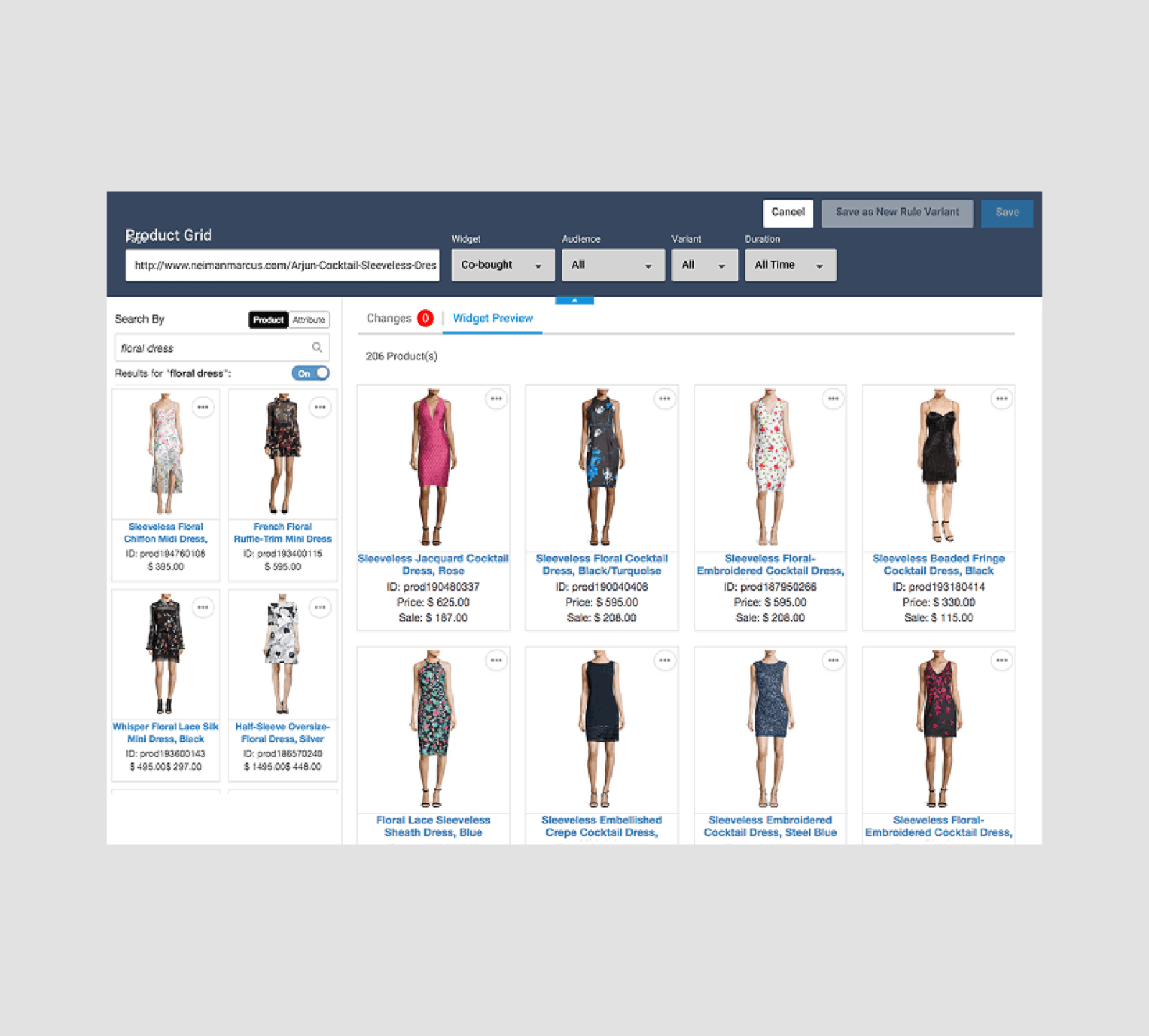
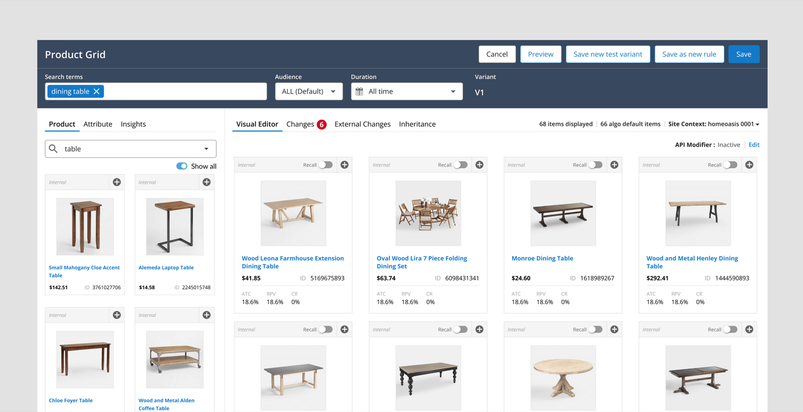
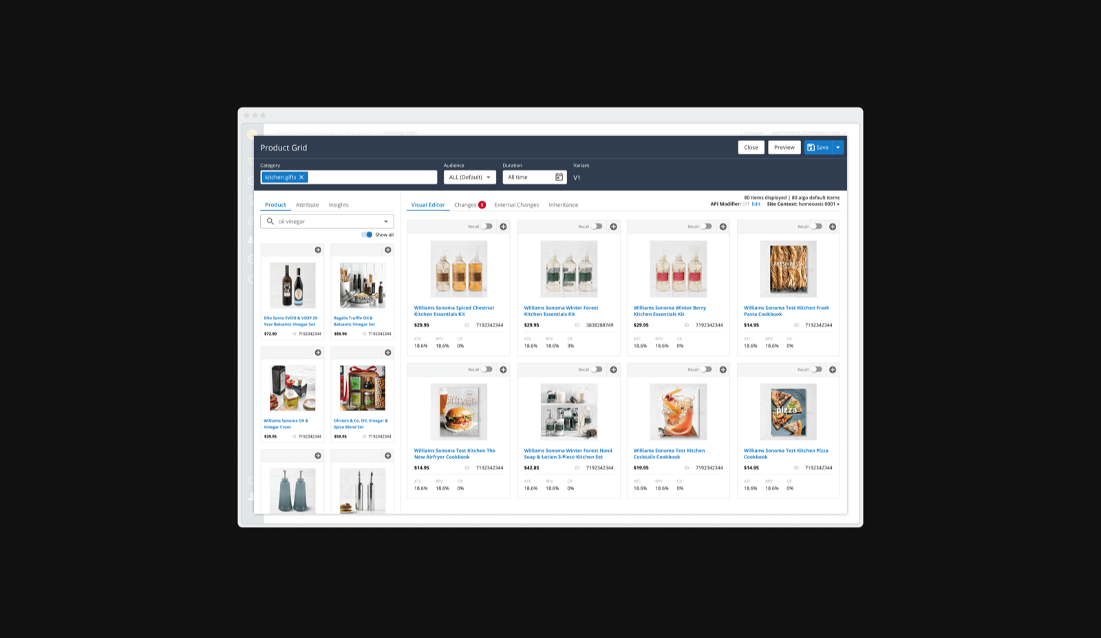
What replaced the three environments: one unified grid workspace, whatever the catalog.
The grid became the control surface
The redesign started by changing the relationship between configuration and result. Instead of asking merchandisers to configure logic in one place and inspect its consequences somewhere else, we made the product grid itself the primary workspace.
Merchandisers could work directly with the result set — drag products into new positions, boost or bury them, exclude them, lock them into intentional positions, add missing products into recall, apply product or attribute-based rules, and preview the final layout in real time.
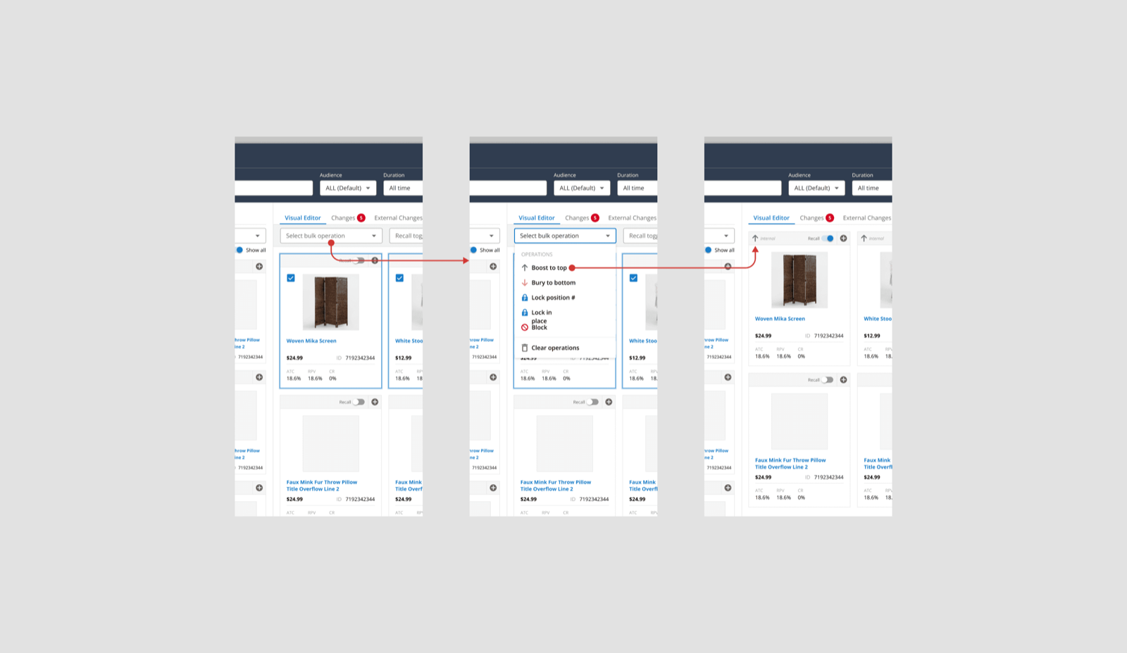
Different workflows could begin differently but resolved into the same merchandising model. A user could act on a single product card, select products in bulk, drag within the grid, or bring products in from the supporting panel. The interaction changed. The intent didn't.
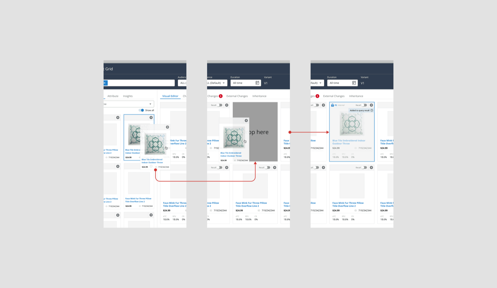
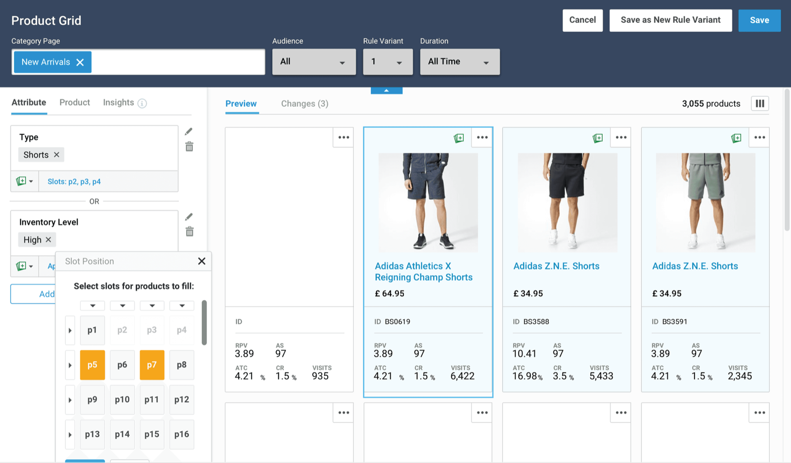
Different ways to express the same intent, resolving to the same result — with precise slot positioning when it's needed.
Balancing business intent with algorithmic ranking
The most important design problem wasn't drag-and-drop. It was determining how much control a merchandiser should have over an intelligent system. Some users wanted fine-grained control over almost every product. Others preferred to let the ranking algorithm do most of the work and intervene only where business strategy demanded it. The interface had to support both.
Position locking became one way of expressing that balance. A merchandiser could intentionally place or lock specific products while allowing the rest of the grid to keep adapting around those choices — preserving a campaign, product launch, or commercial priority without manually designing every position on the page.
Precise human control where it mattered. Algorithmic optimization everywhere else.
Sometimes ranking isn't enough
One small feature demonstrates the complexity of merchandising particularly well: Add to Recall.
Boosting only changes the ranking of products already eligible to appear. Imagine a merchandiser launching a new promotional product. They might boost it aggressively — but if the search algorithm doesn't naturally consider the product relevant to that query or category, there's nothing to boost. The product isn't in the recall set.
Add to Recall gives the merchandiser an explicit way to introduce it. Once the product enters the result set, they can decide how prominently it should appear using the rest of the merchandising system. This is where Product Grid Editor moved beyond rearranging tiles — it became a way to express business intent directly against algorithmic search behavior.
Rules needed context, not more complexity
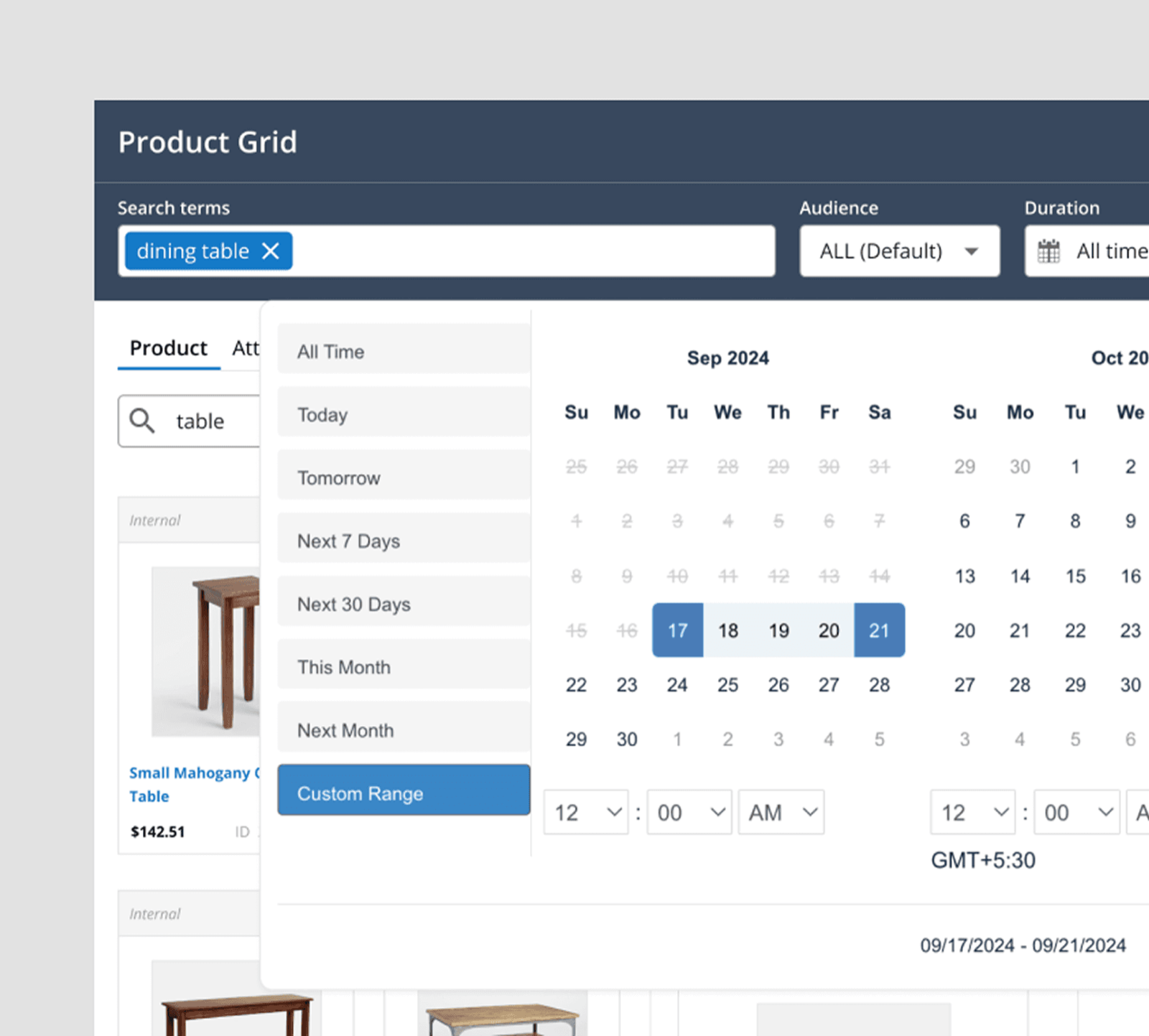
The editor also had to support the less visual side of merchandising. Rules could operate against searches or categories, target different audiences or durations, and use products or attributes as conditions. Rather than flattening everything into one dense configuration surface, we organized the experience around the context users were already thinking in.
A merchandiser could start from a query or category, refine who or when the rule applied to, find the relevant products or attributes, and see the resulting effect in the visual editor. The supporting interactions — query and category autosuggest, audience and duration controls, searchable and filterable attributes, product- and attribute-level rules, and rule management — all returned to the same visual grid as their common feedback layer.
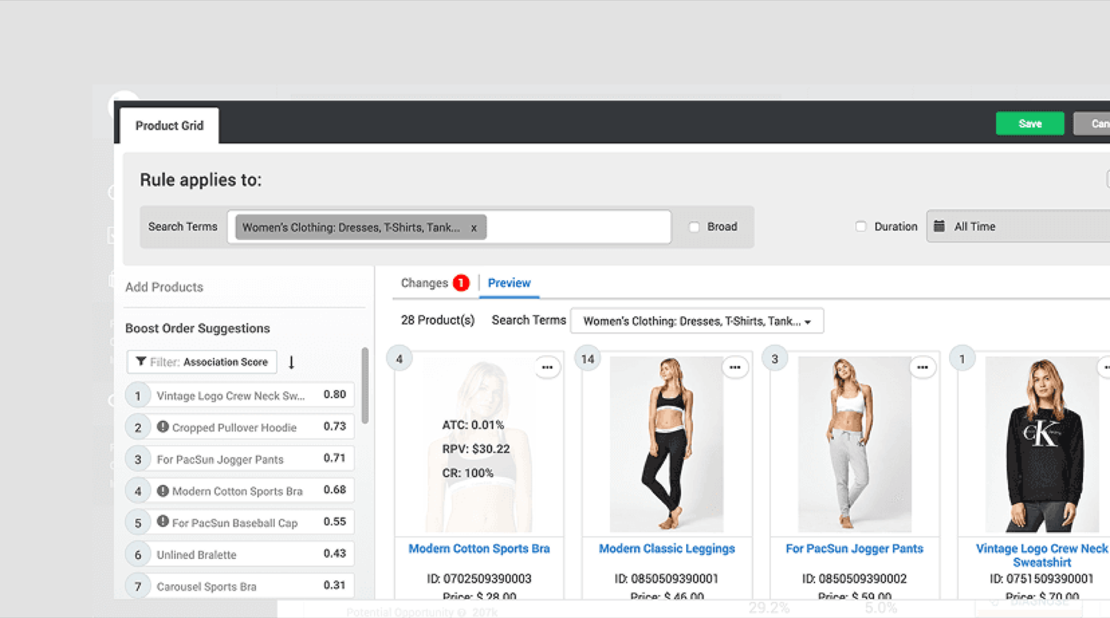
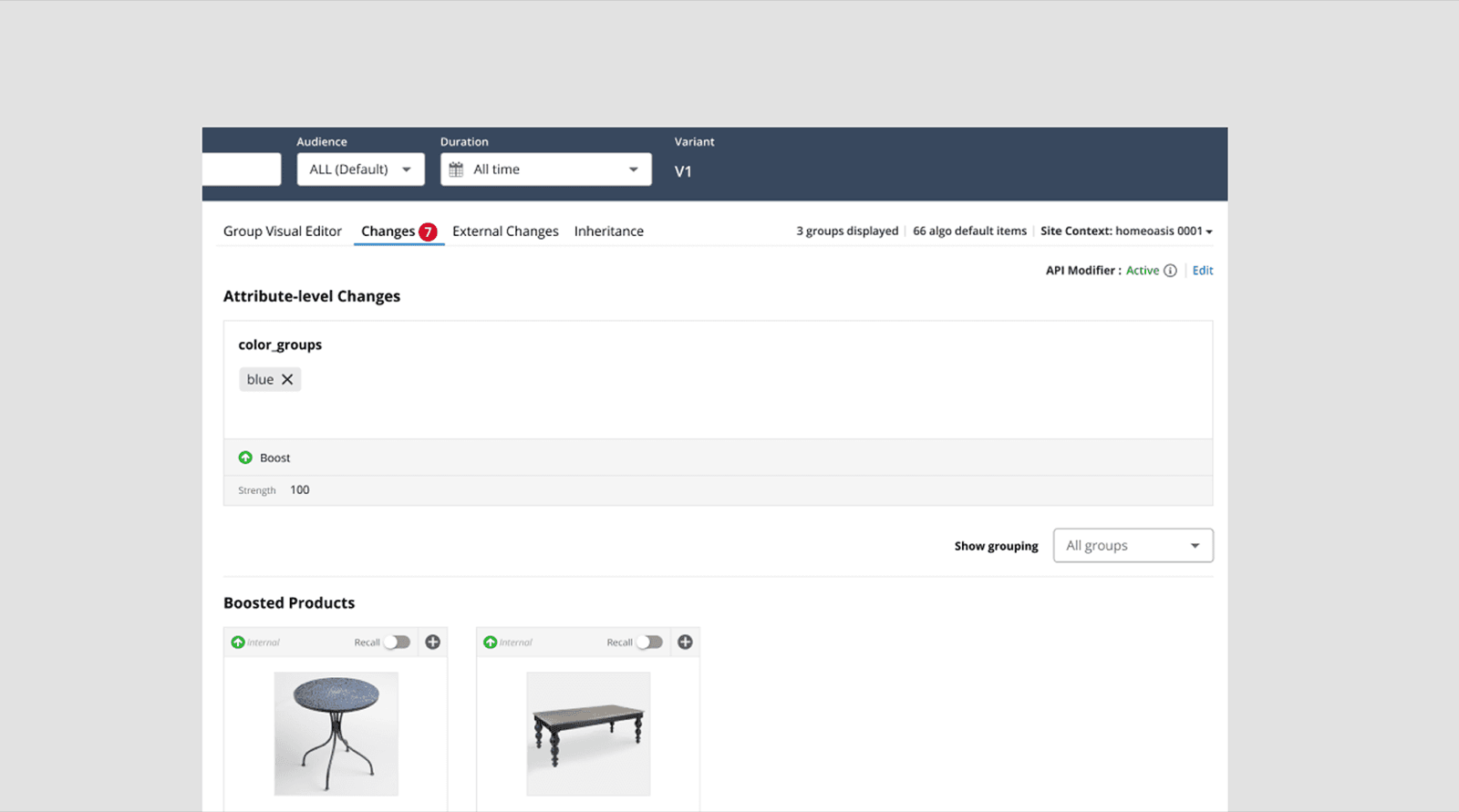
Configuration anchored in the merchandiser's task: choose context, set audience and timing, define the condition, inspect the result.
Real products need to explain conflicting states
A happy-path editor wasn't enough. Merchandising rules can overlap. Changes can be introduced from elsewhere in the system. A manually positioned product can interact with a global rule. A product added to recall can inherit other merchandising behavior. Bulk operations can introduce practical system constraints.
So the design had to communicate not only what the user had done, but what other forces were affecting the result. We designed states for conflicts, external changes, recall behavior, and system limits, so users could understand unexpected outcomes without leaving the editor.
One example was bulk product selection. Certain operations carried a product-ID limit. Instead of leaving users to discover the constraint after completing a large selection, the workflow needed to make that limit visible at the point of action. The details were less visually dramatic than drag-and-drop. They were just as important.
Trust in an enterprise tool is built at the edges.
Preview before publish
Merchandising decisions ultimately affect shoppers, so the editor needed to close the distance between what the merchandiser configured and what the shopper would actually see. Real-time preview let teams inspect the exact product layout before pushing a change live.
Instead of treating rules as abstract configuration, the interface gave immediate feedback on how those decisions affected the page. That mattered for more than aesthetics: teams were making changes intended to influence search relevance, conversion, revenue per visit, campaign performance, and overall business agility. The preview was designed to make those interventions easier to reason about before publication.
Designing a system, not a screen
Unifying three legacy environments also meant unifying years of interaction patterns. Product cards, selection states, merchandising actions, rule states, conflict messaging, drag-and-drop behaviors, filters, and feedback all needed to feel like parts of one product. I worked through them as a system rather than solving each feature independently, so the foundation could keep evolving after launch.
That system got built while the features shipped, not before them — established in motion, on a live product, rather than handed down from a finished spec. It's slower and more political than a clean foundation. On a product already in customers' hands, it was the only way it was going to happen.
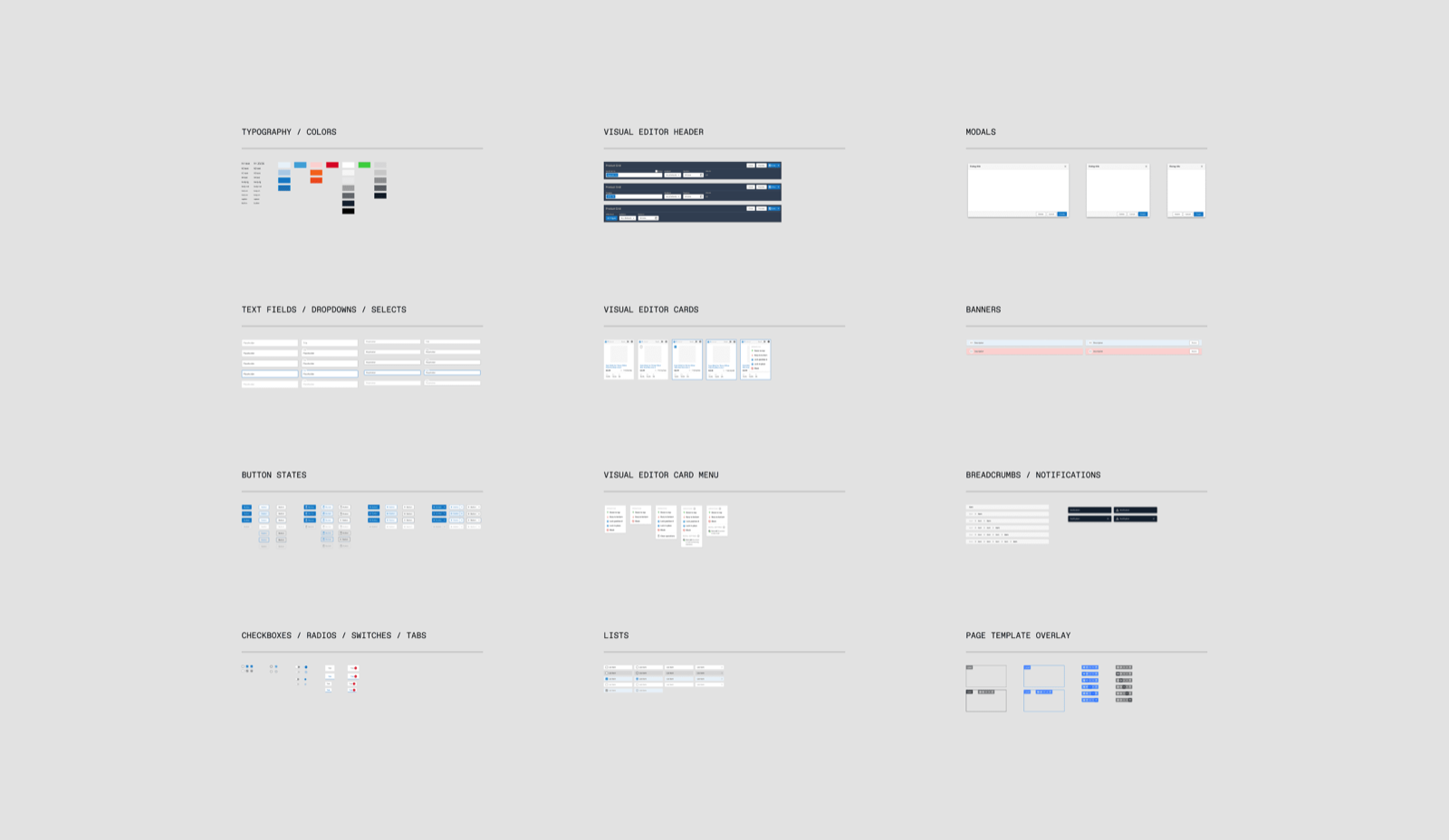
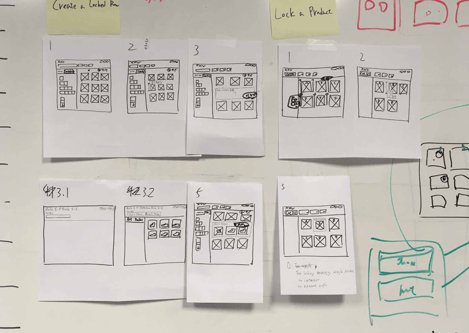
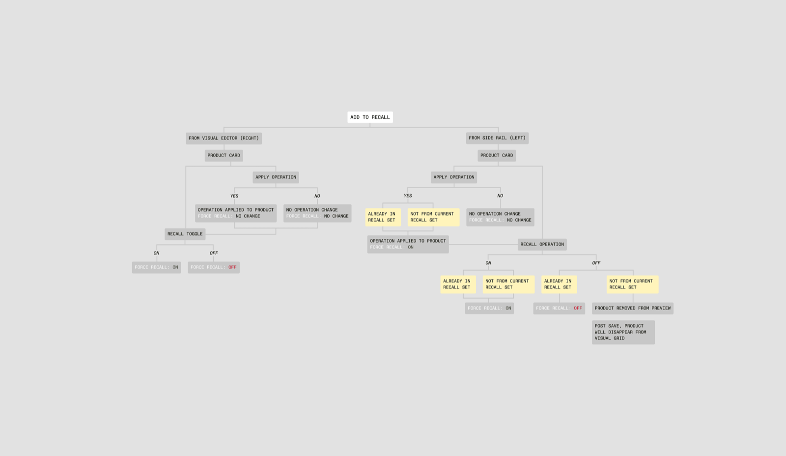
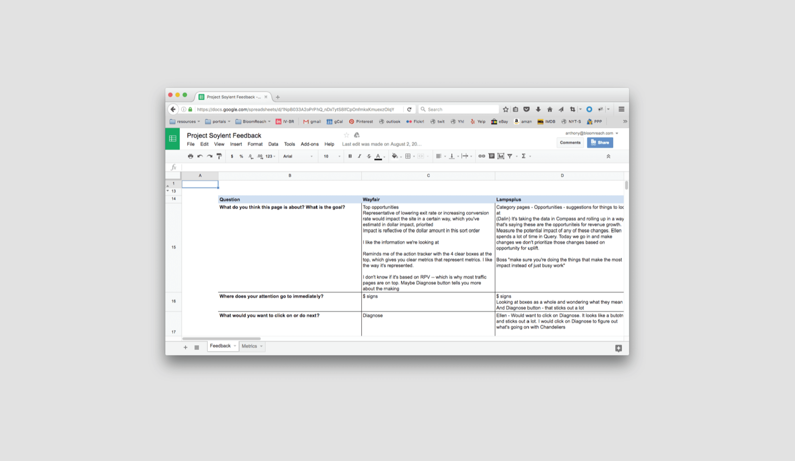
From paper sketches to mapped logic — the system reasoned out while the product moved under it.
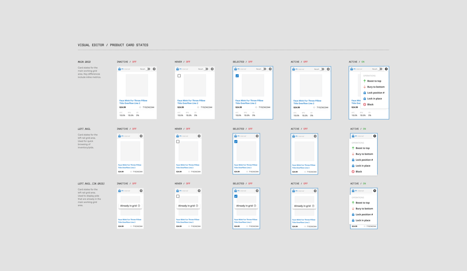
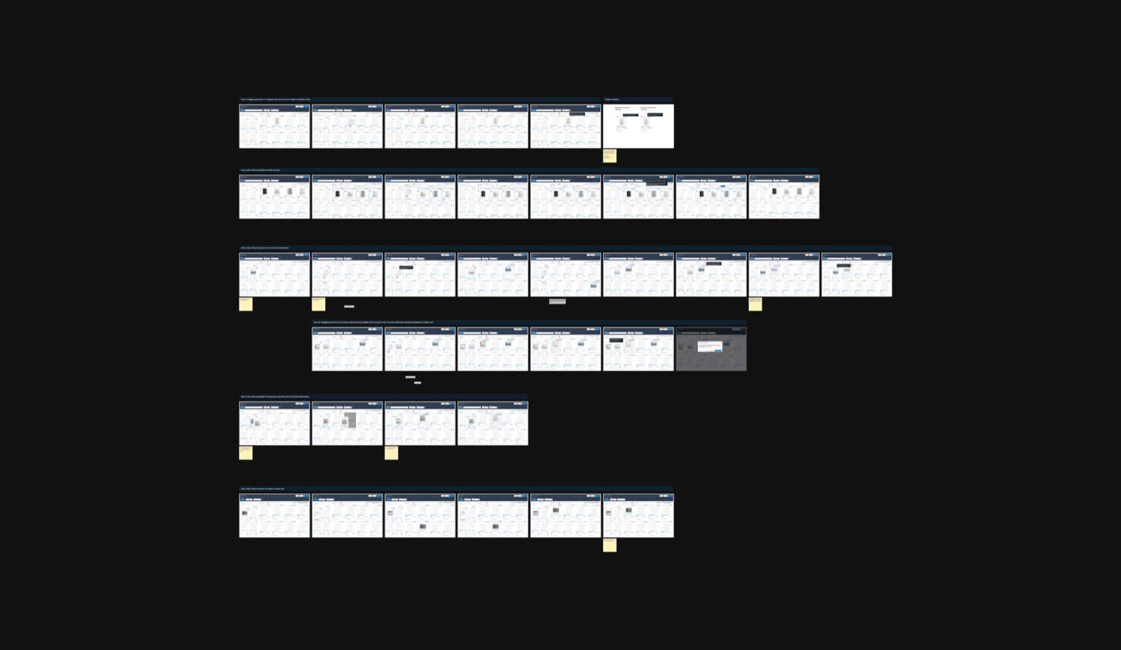
Wireflows and screen states explored across the workspace.
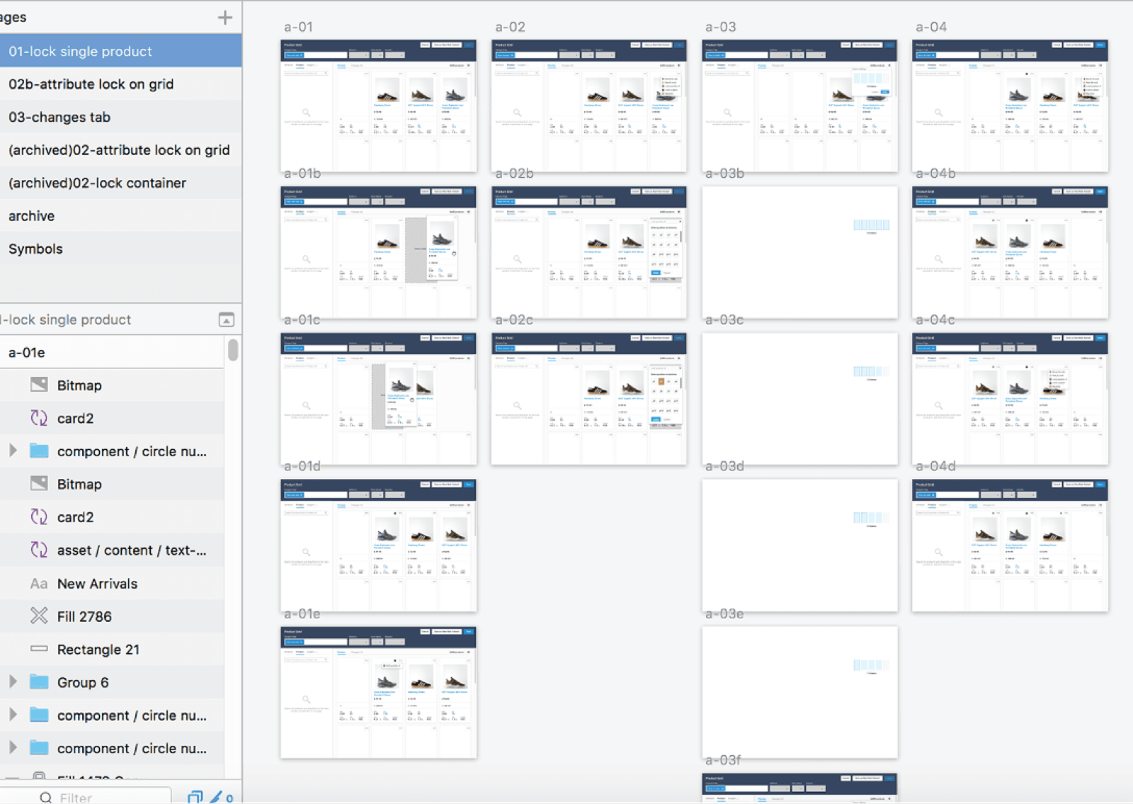
Shipping was part of the design process
The Product Grid Editor wasn't a speculative redesign. It shipped, and is used by real Bloomreach customers. I remained the primary designer through implementation, working with engineering to resolve interaction details, test edge cases, and adapt the system as the real product exposed constraints that weren't always visible in Figma. After launch, I kept designing new features and improvements as requirements emerged.
That continuity mattered. The real measure of the system wasn't whether it produced a convincing prototype — it was whether it could survive production and keep absorbing new product complexity.
Impact
The redesign consolidated ranking logic, visual grid control, content placement, and preview into a single operational experience. For merchandisers, it brought decisions previously made across separate tools into the same workspace, making the relationship between business intent, merchandising action, and shopper outcome visible in context. For Bloomreach, it created a more coherent foundation for continued merchandising development.
I don't currently hold recorded post-launch impact metrics for this work. What I can substantiate is the delivered product and the design decisions behind it — the Product Grid Editor shipped to production, is used by real customers, and continued evolving after its initial release.
What I took away
Simplifying complex software doesn't always mean removing complexity. Merchandisers needed sophisticated controls because the decisions they were making were sophisticated. The more useful goal was to make that complexity easier to reason about — to focus on the relationships between action, state, system behavior, and outcome. When those relationships are clear, a product can stay powerful without making users feel like they're operating the underlying machinery.
Bloomreach Grid Editor case study