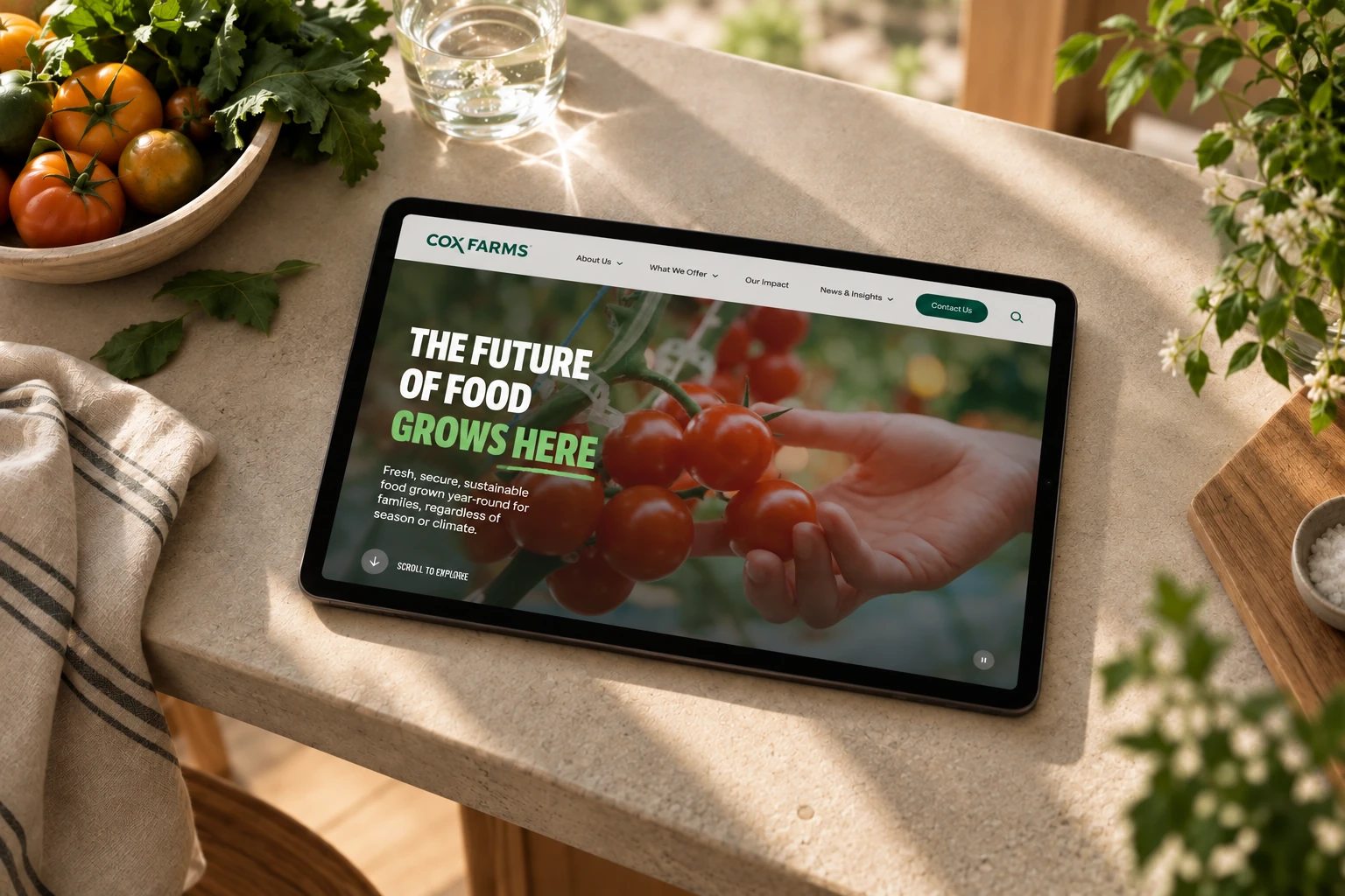
Cox Farms
Redesigning Cox Farms' homepage around a single, overlooked principle: scroll depth is a cue problem, not a content problem.
The data looked damning: most visitors to the Cox Farms homepage never scrolled past the first content block. Scroll depth sat at 43%. The obvious move was to blow up the content.
I didn't — because the same data told on itself. The About page hit 86%, Our Brands 73%. Same content team, same audience; only the homepage stalled. So it wasn't a content problem. Something at the very top was stopping people before they got to the rest.
“Arduous to scroll down. Like, it's, like, effortful.”
The stall was a symptom
Before anything hit Figma, we ran a design alignment workshop with the Cox team, co-led with their design director. What came out wasn't a punch list — it was a shared vocabulary for what felt off.
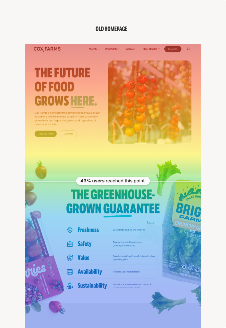
The brand had started feeling “a little too templated.” Someone called it “financial conglomerate,” and it landed: a gap between what Cox actually is — greenhouse innovation, a food-security mission — and how the homepage made you feel. Hierarchy and copy were fine. What was missing was momentum — the motion and reveals that tell you there's something worth finding below.
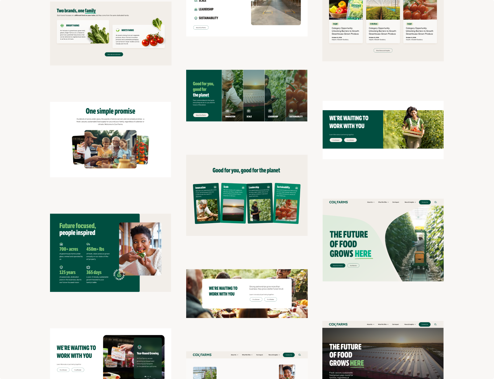
Three sections, rebuilt not refined
Cox arrived with a round of comps already reviewed and rejected. Three sections needed real redesigns, not touch-ups — and they weren't wrong.

Each had drifted the same way: reaching for visual interest, landing on decoration. So each got the same fix — cut the effect performing for attention, replace it with motion that earns the scroll. One rule, three times.
One Simple Promise
Fanning cards that looked interactive but weren't — a false affordance, and a fast way to lose trust. I swapped them for a scroll-triggered typographic reveal: copy-driven, warm, no heavy assets competing for attention.
Brand Pillars
Two variants chased visual interest and undercut it — too busy, too playful for content that needed to read as commanding. I put all four up at once, with a word-image-copy reveal and click-to-deepen. Architectural, not editorial.
The Stats module
Engineering's critical path. An image was hogging the space the numbers should own, and each of the four needed its own link deeper into the site. I rebuilt the hierarchy around the numbers — four clear entry points — and got PM sign-off on the deep-links before building, not after.
Earned Motion
The brief was “make it feel alive,” and the easy read of that is spectacle. I went the other way. If motion was the fix, it couldn't be decoration bolted onto seven sections one at a time — it had to be a system.
So I wrote the rules down as tokens, not one-off animations — each named, each fixed, every section drawing from the same set:
- Reveal on entry, never on load — motion fires as a section scrolls in, rewarding the scroll instead of front-loading the page.
- Parallax at 0.2–0.3 — enough for depth, quiet enough to never pull focus from the copy.
- ~100ms stagger — one cadence, so a reveal in the Pillars reads like one in the Stats module.
- Reduced-motion fallback throughout — every token degrades to something static and legible. Non-negotiable.
Tokenizing the motion did the quiet work a design system is supposed to: it made the handoff unambiguous. A stagger meant the same thing in code as in Figma, and no section could invent its own timing.
Motion that shows off competes with the content it's supposed to move you toward.

The system beneath
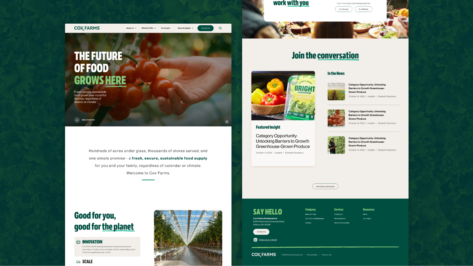
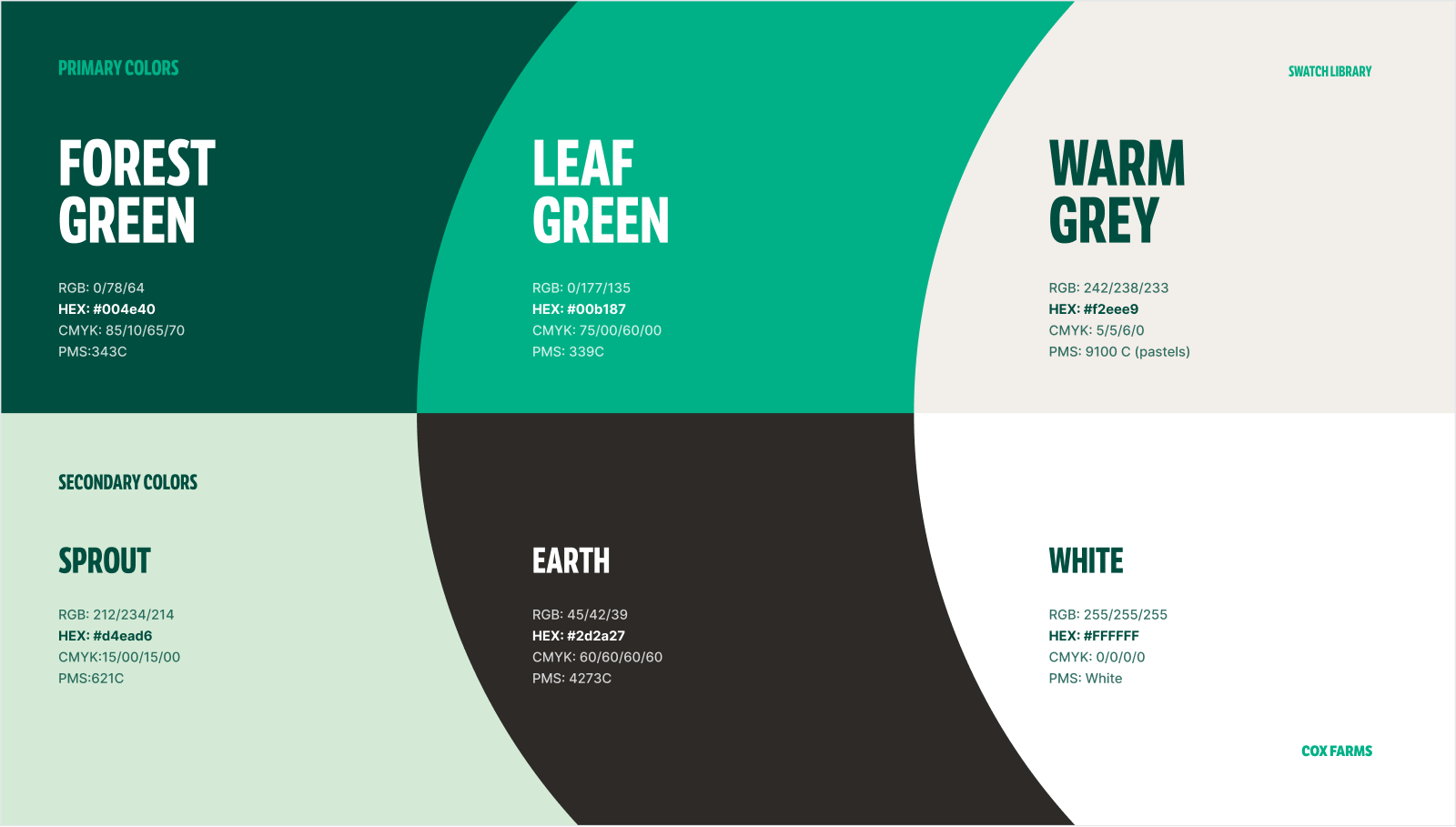
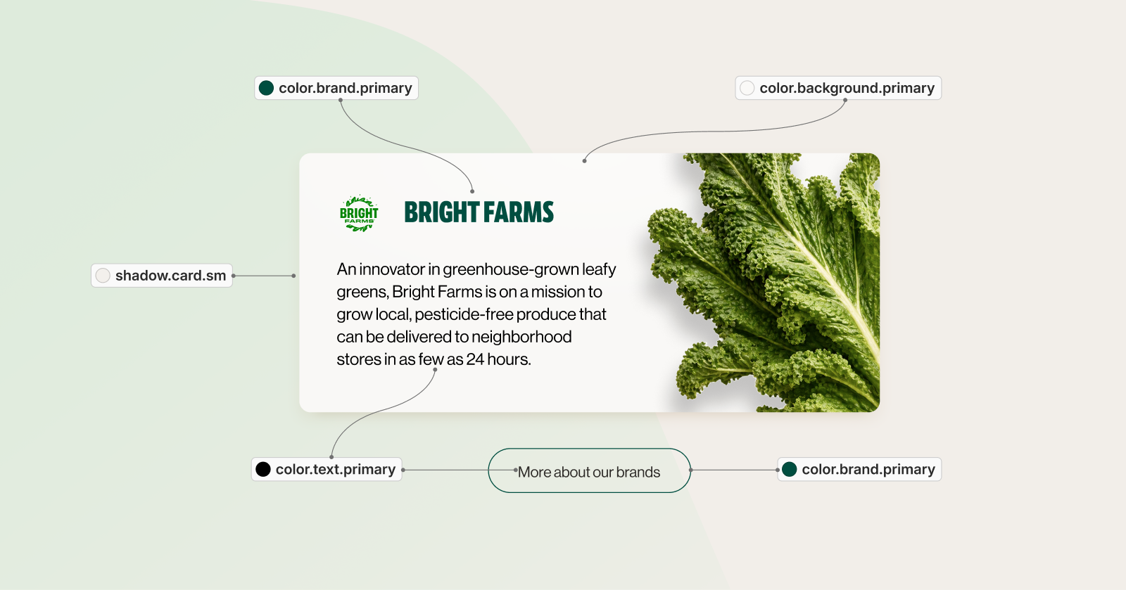
Motion was only the top layer. Underneath sat the part that made the whole redesign repeatable: a color foundation, semantic tokens, and a component library — so every section spoke the same language, and engineering never had to guess at a value.
Impact
The homepage went live June 4, 2026 — pushed at 5 AM, live by 8. The full scroll-depth read lands after 30 days of tracking, so the final number is still in the air. But the early signal is good: scroll depth is already lifting, and more people are making it past the block that used to stop them.
What's already clear: the sections that took the most iteration — Pillars, Stats, Promise — are the exact ones the client pushed back on hardest in round one. Where the feedback was sharpest, the brief was still being written. Treating that friction as signal, not noise, was the right call.
What I'd do differently
Set the scroll-depth target before the first client presentation. A number like “65%+” would have anchored every decision and protected scope up front.
Get PM sign-off on interactive scope before designing it. The stats deep-links and the reusable carousel were scope questions as much as design ones.
Say the insight out loud, in the room. A few times I facilitated the client toward a conclusion instead of just naming the design read — “here's what I think the problem actually is” is the stronger move.
The content was never the variable
Our field loves to treat scroll depth as a content problem — too many words up top, wrong hierarchy. Sometimes it is. Not here. The same team ran the interior pages to 73–86% while the homepage stalled at 43%. The variable was never the content; it was the experience of moving through the page. Every brief that opens with “users aren't scrolling” deserves one question first: did we give them a reason to?
Cox Farms case study