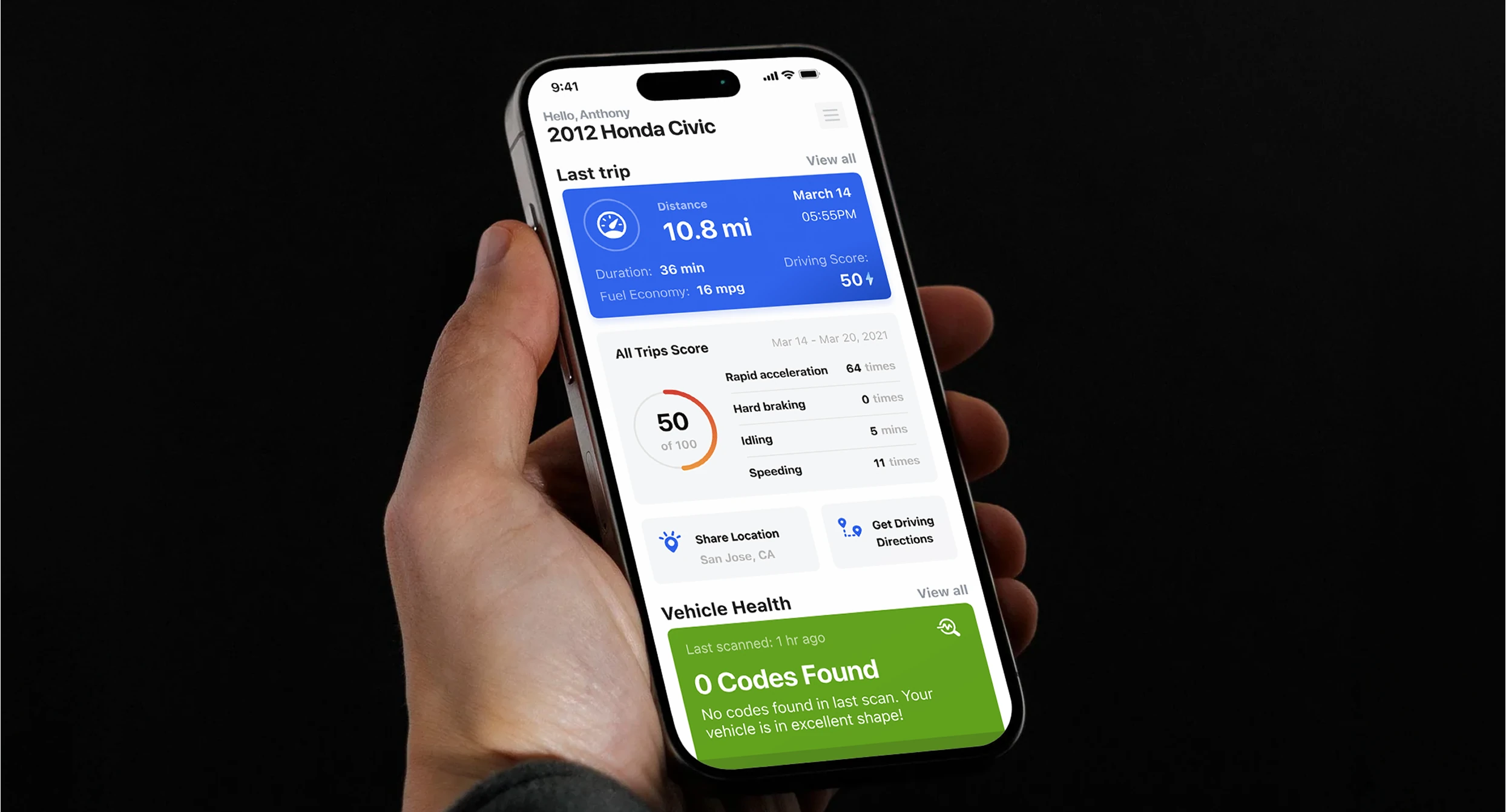
Innova RepairSolutions2
Turning RepairSolutions2 from a mechanic's tool into a driver's companion.
RepairSolutions2 could read any car — engine codes, sensor data, diagnostic charts, everything a mechanic needs. It just happened to be built for the mechanic, and it was being handed to the driver.
So the app knew exactly what was wrong with your car, and told you in a language you didn't speak. Trip data, diagnostics, maintenance — each in its own tab, so you could see what the car was doing but never how it fit together.
A language the driver already speaks
The real problem was language. The app spoke in codes; drivers think in symptoms. Closing that gap started before any screen — with the product's own voice. A warmer mark, and a type system tuned for reading a warning at a glance instead of scanning a spec sheet.
The identity, reset — the first place the app stopped sounding like a diagnostic tool.
From there, the rebuild: one connected app instead of a stack of tabs, so trip, diagnostics, and maintenance finally read as a single story.
The screen that mattered most
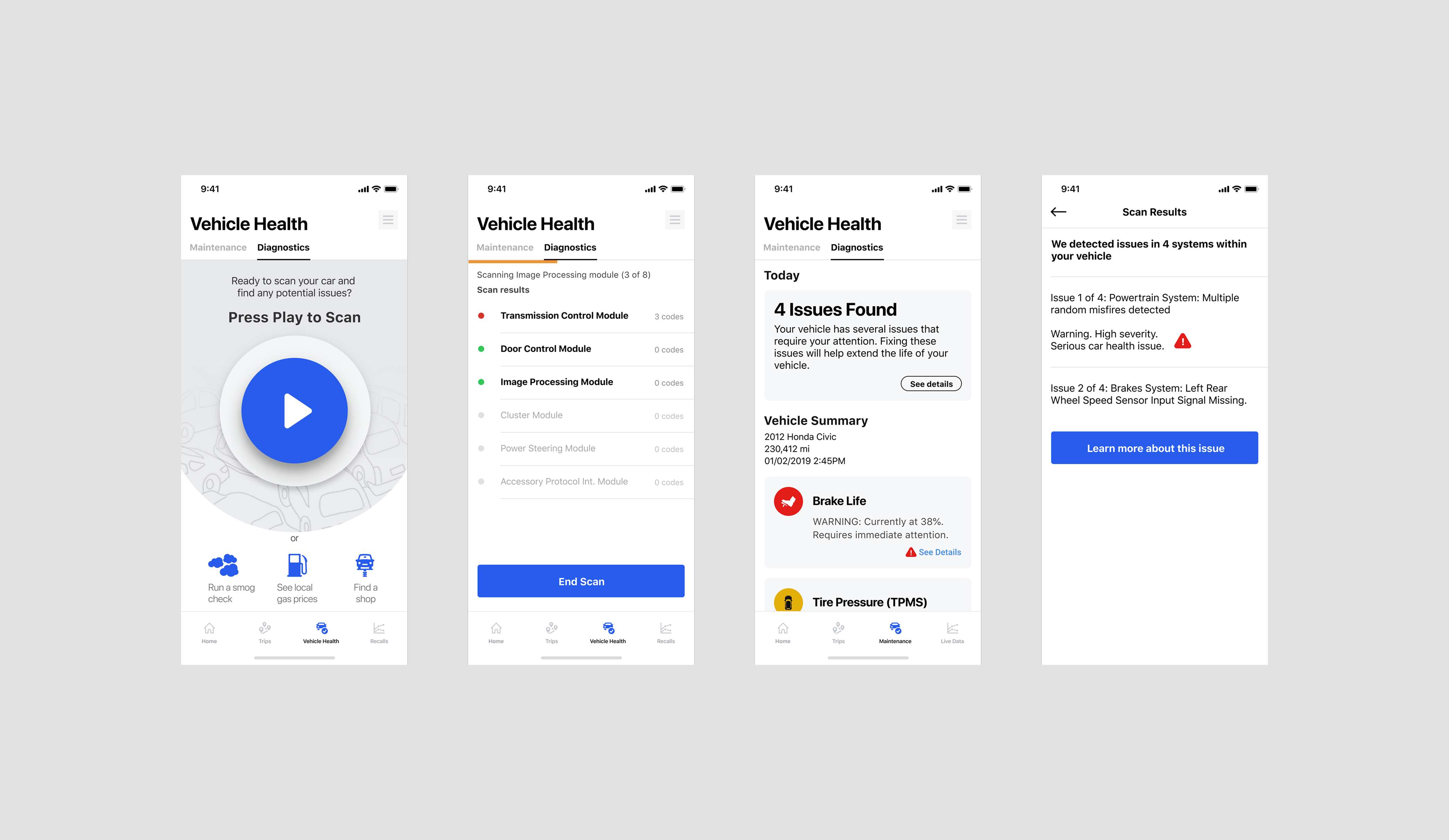
It wasn't the dashboard. It was the half-second right after a scan finished. In the old app, that screen could say “P0301: Cylinder 1 Misfire Detected.” Technically correct — and exactly where people left, for a search engine, a forum, or a mechanic, because it showed the car's language before telling them whether to worry.
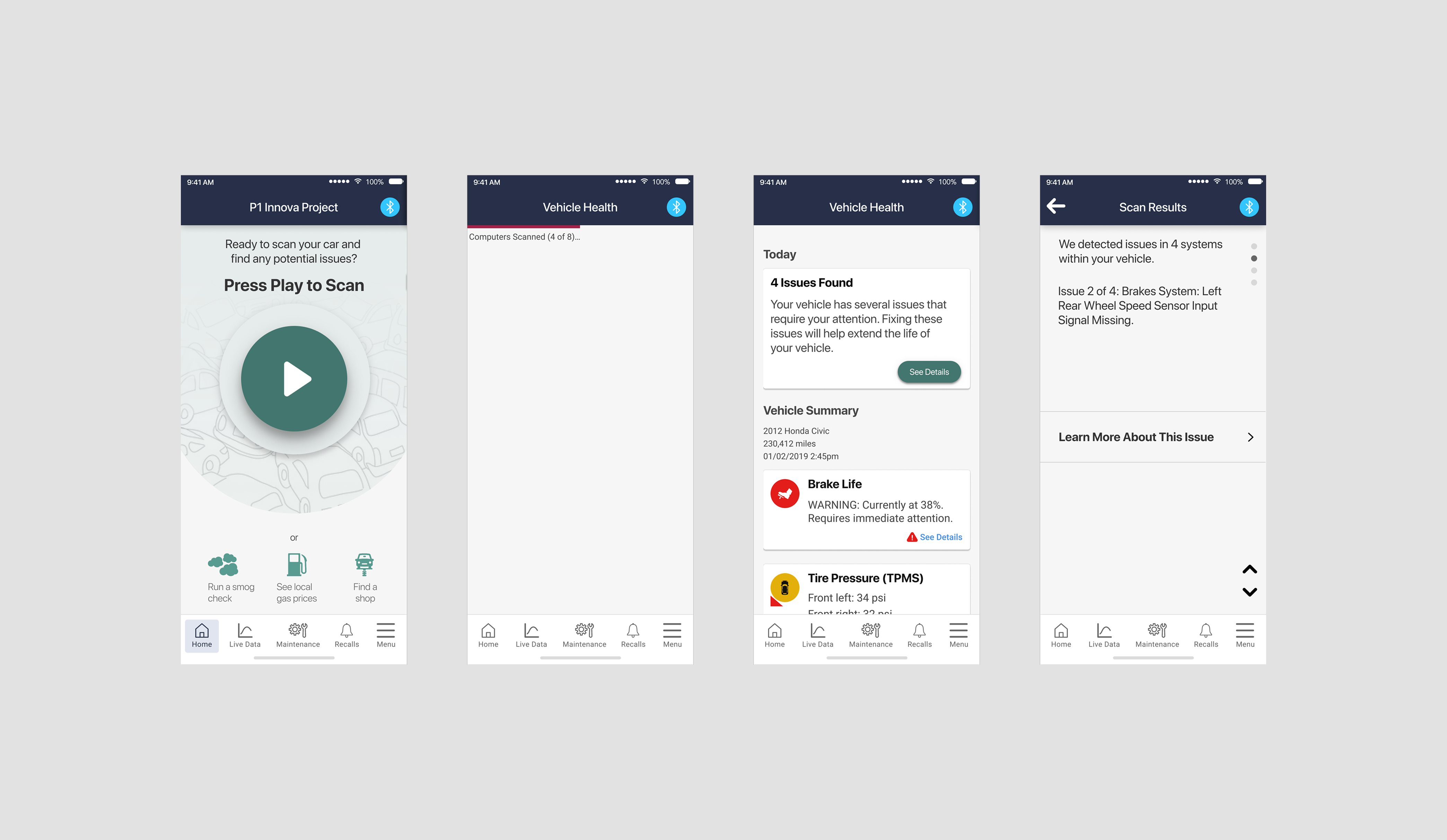
The easy fix was a green check: hide the messy data and just say fine or not-fine. I passed on it. A checkmark you can't question feels calm right up until something's wrong — and then you're back to asking a stranger. So I rebuilt the result screen in a deliberate order: severity, then symptom, then the evidence underneath.
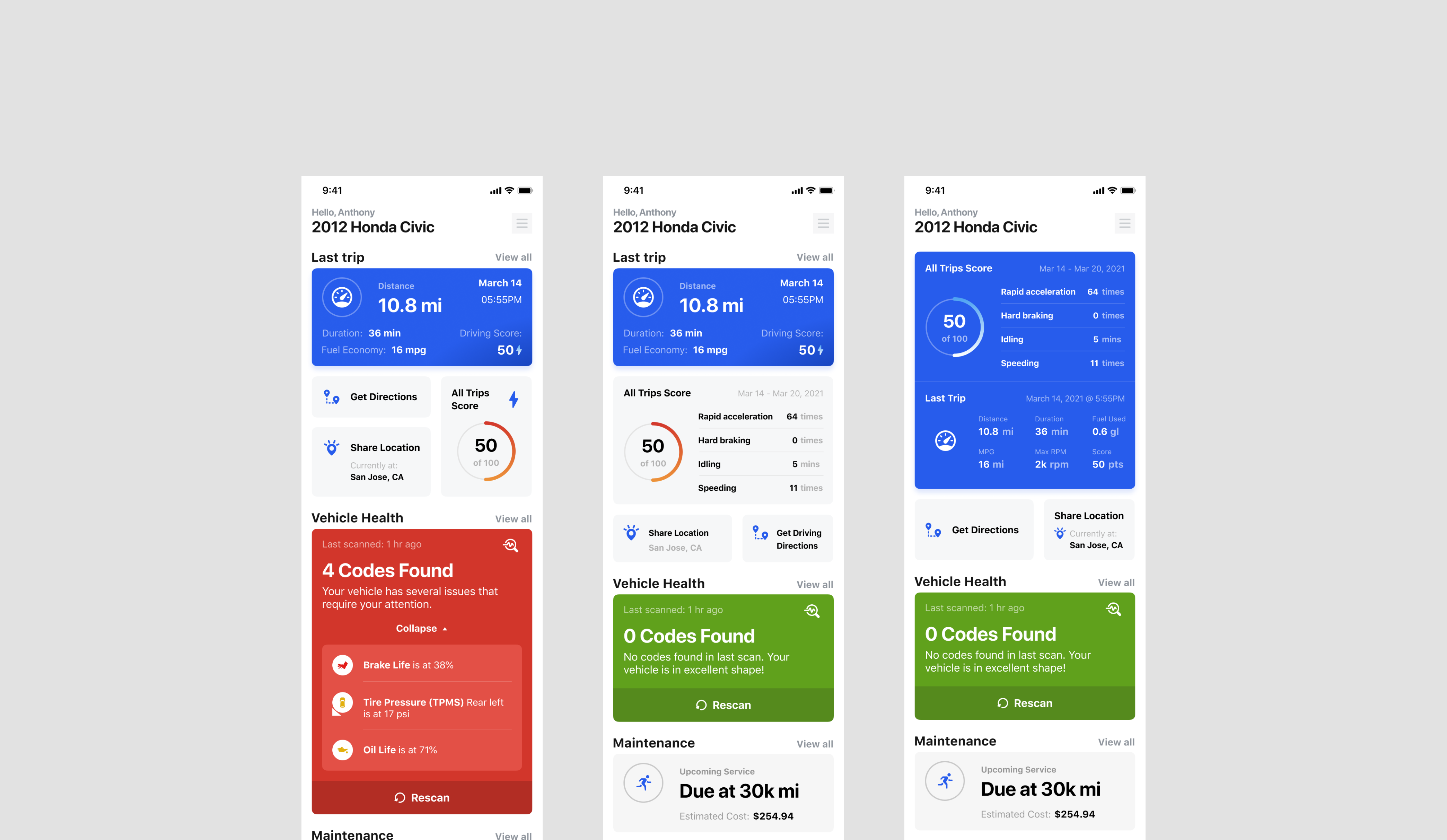
First, the redesign refused the old tab split. Trip data and diagnostics had lived apart — easy to build, and exactly the problem: you could see how the car behaved and how the trip went, never how they related. Now they share one connected view. Sessions ran 35% longer once there was a thread to follow.
The two surfaces a driver actually checks: how the trip went, and whether the car's okay.
Severity first. The scan resolves into Vehicle Health with a color before any code — red for issues, green for none. That answers the only question you actually have in the moment: do I need to deal with this?
 BeforeAfter
The finding as a symptom, not a code. Each issue is written in plain terms, with a sense of how urgent it is, sitting next to everyday checks like brake life and tire pressure. Nobody has to go translate “P0301” on their own.
The raw code, one tap away. “P0301” and the sensor data still live under “Learn More About This Issue” — for the driver who wants proof and the mechanic who needs the dump. The plain-language layer sits on top of the real data, not in place of it.
None of this made the diagnostic any simpler. It changed the order you meet it — severity, then symptom, then the evidence underneath. Drop-off after a completed scan fell 40%, at the exact screen that used to lose people.
A reason to open it every day
A code reader is something you open once a problem has already happened. I wanted it open every day, so I brought driving in through the Waze SDK. It was scope the app didn't strictly own, plus the maintenance that comes with it — but it gave the product a reason to be there on an ordinary drive. Daily active users doubled within three months.
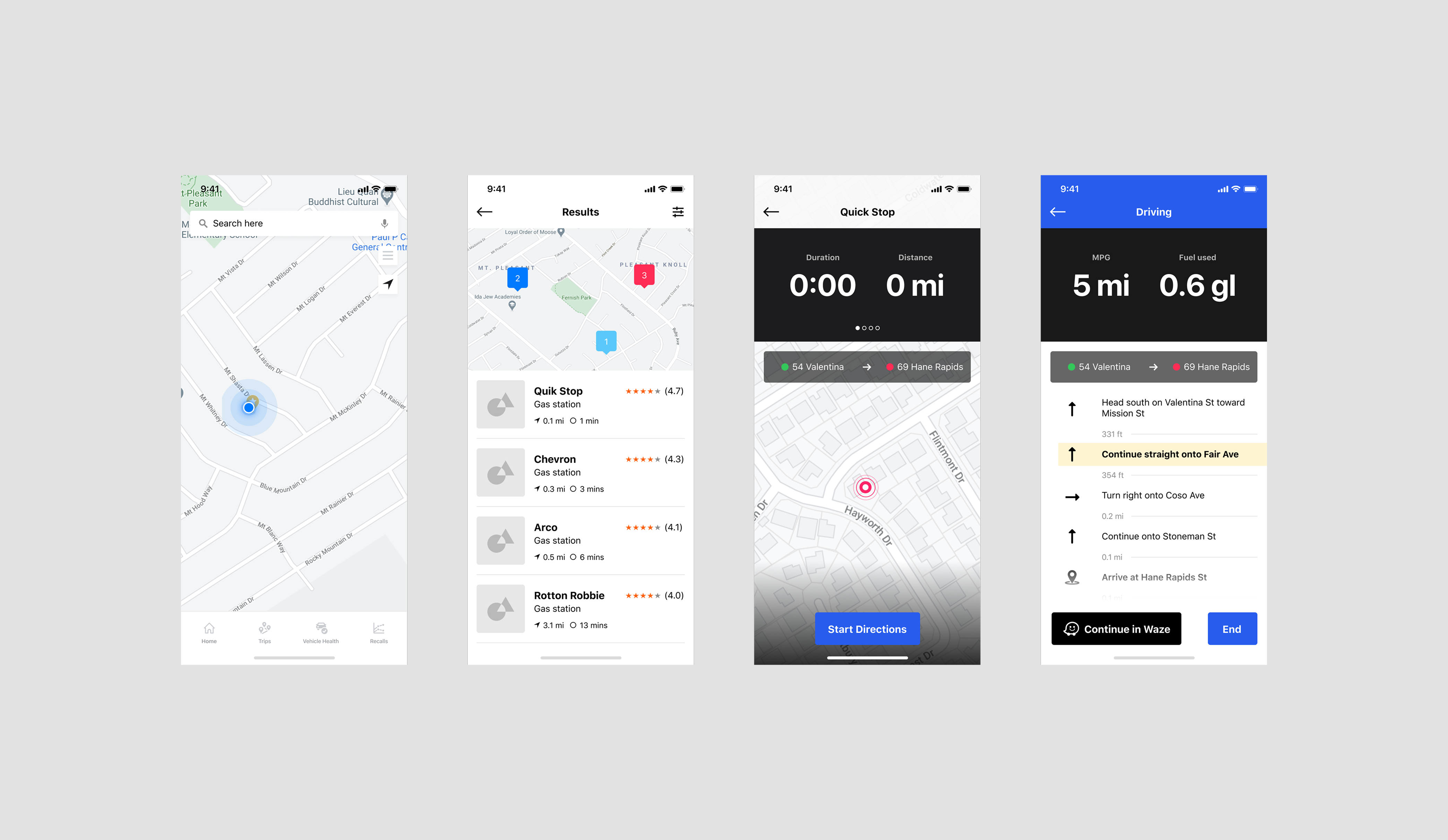
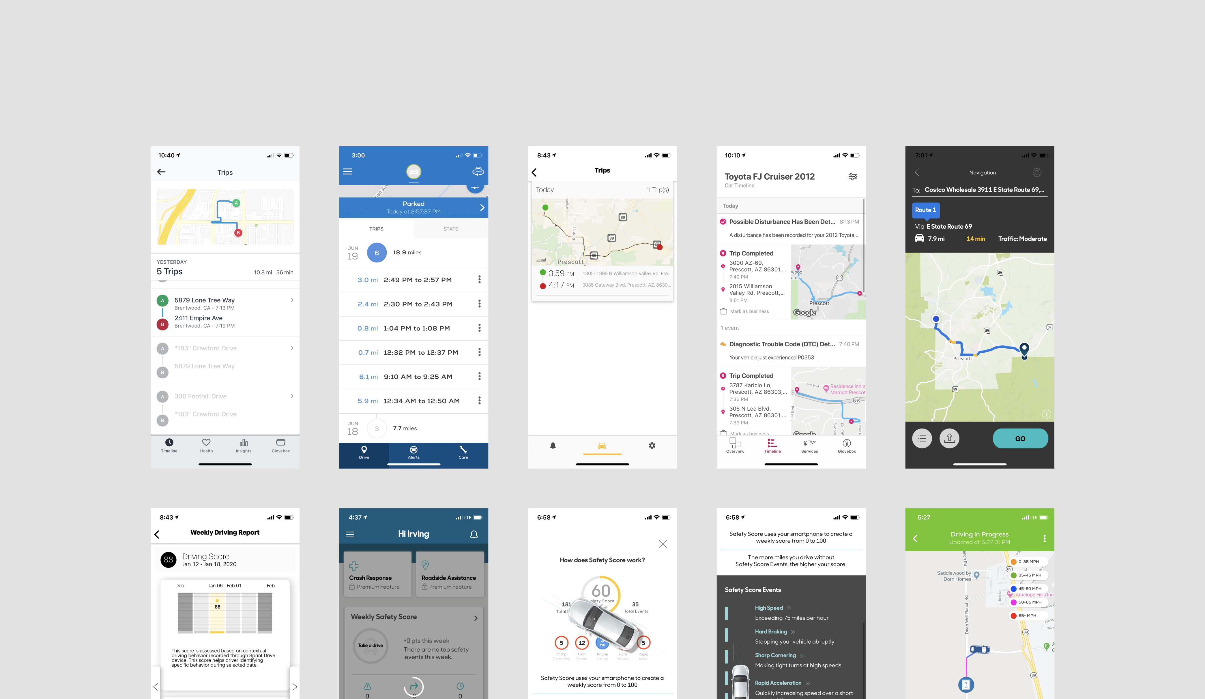
A code reader became something a driver opens every day.
One system, built up front
Standardizing type, spacing, color, and components before every module existed was slower than shipping screens one at a time. I made the slower bet so a driver never has to relearn what severity or vehicle health look like each time a new module or vehicle type shows up.
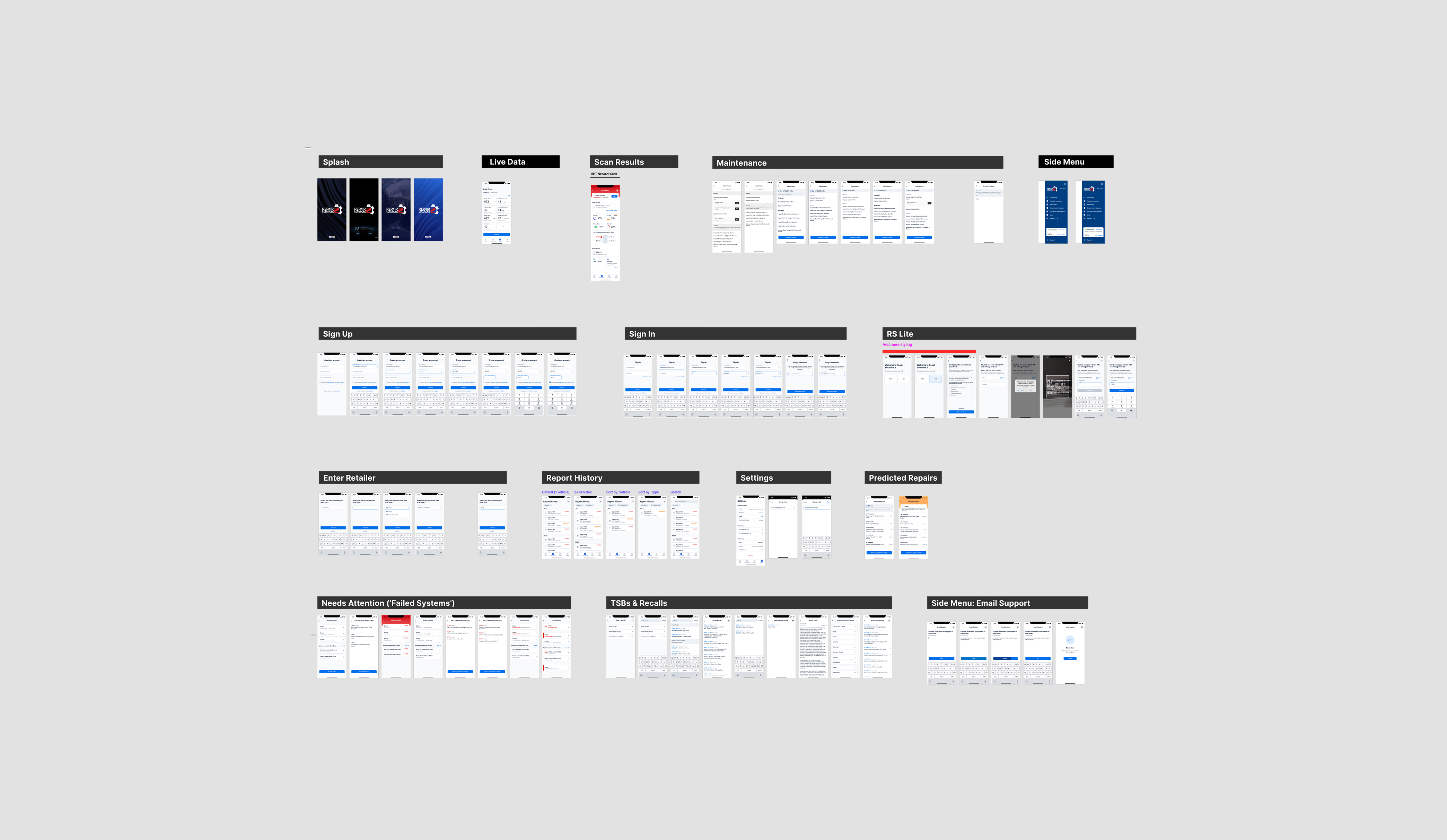
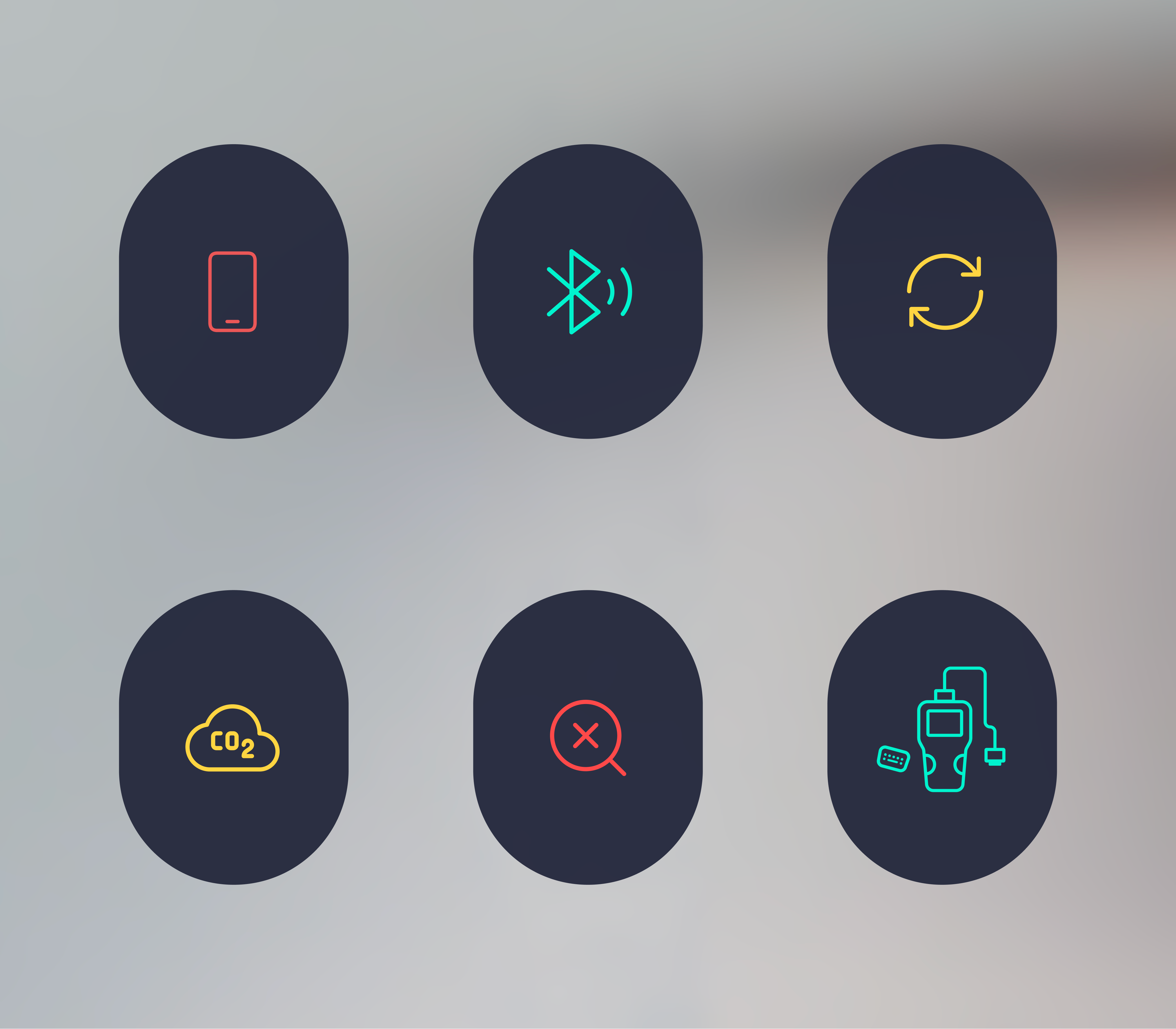
One language every new module plugs into — components, and iconography drawn for the product.
Impact
The numbers line up with the calls: folding in navigation doubled daily active users; one combined view ran sessions 35% longer; and reworking the result screen cut drop-off 40%.
What I'd carry forward
The car's data never got simpler — engine diagnostics genuinely are complex. What changed is how much of that complexity the interface was willing to carry, so the driver didn't have to. If I did it again, I'd measure that line directly: track how often drivers tap past the plain summary down to the raw code, because that tap tells you exactly where the interface is carrying too much, or too little.
Innova RepairSolutions2 case study