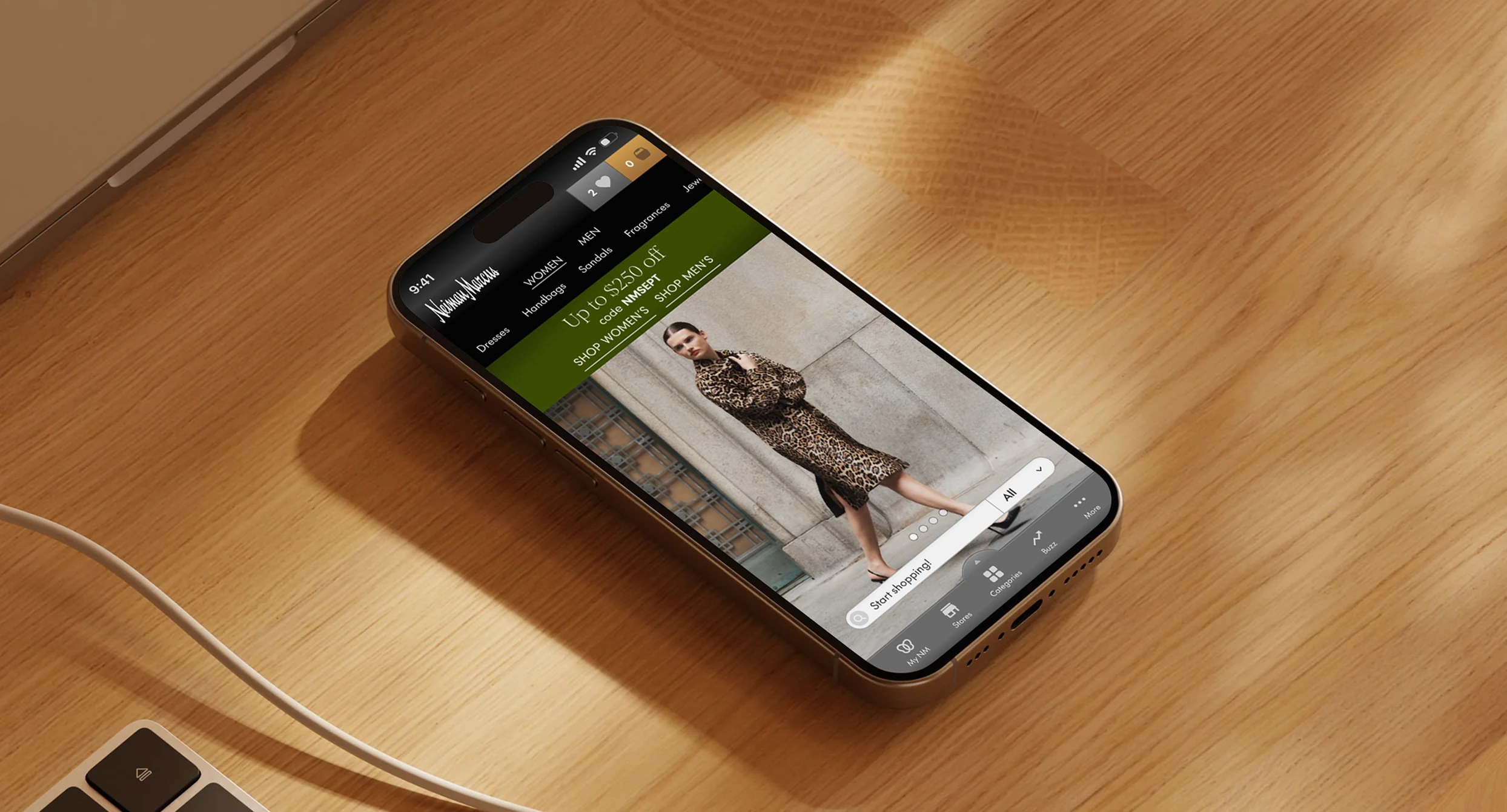
Neiman Marcus
Leading Neiman Marcus' mobile shopping experience while shaping how Bloomreach's intelligence layer lived inside it.
Neiman Marcus is synonymous with curated luxury retail. Getting that onto a phone means solving something desktop ecommerce never has to: space, attention, and navigation all go scarce at once — while a luxury shopper's expectations for taste and personalization stay exactly as high as they are in a physical boutique.
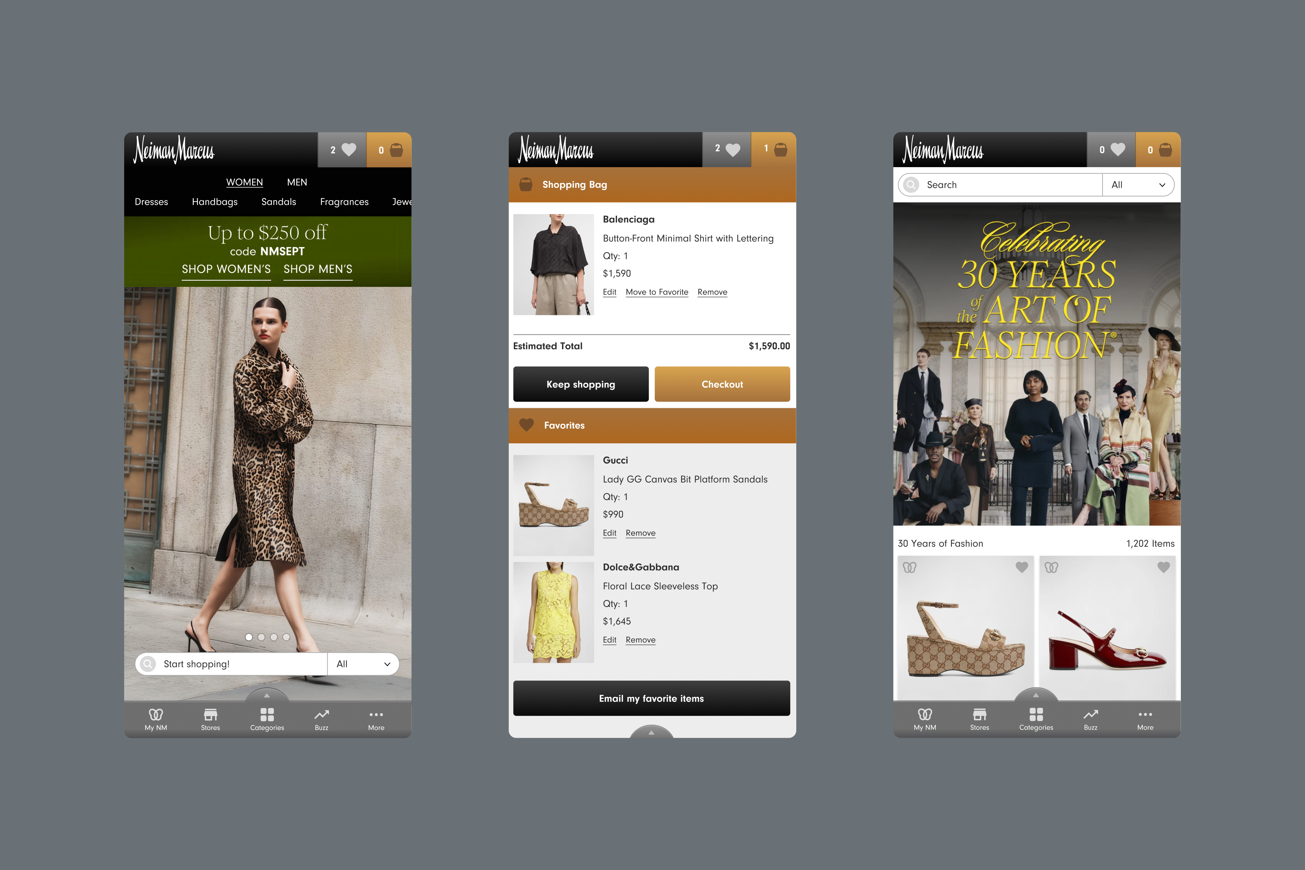
I led two things here at once: the mobile experience redesign, and the discovery layer inside it. Bloomreach supplied the intelligence — behavioral and intent signals, personalization, recommendations — and my design question was where that intelligence should live: woven into the shopping experience, or sitting beside it as one more widget.

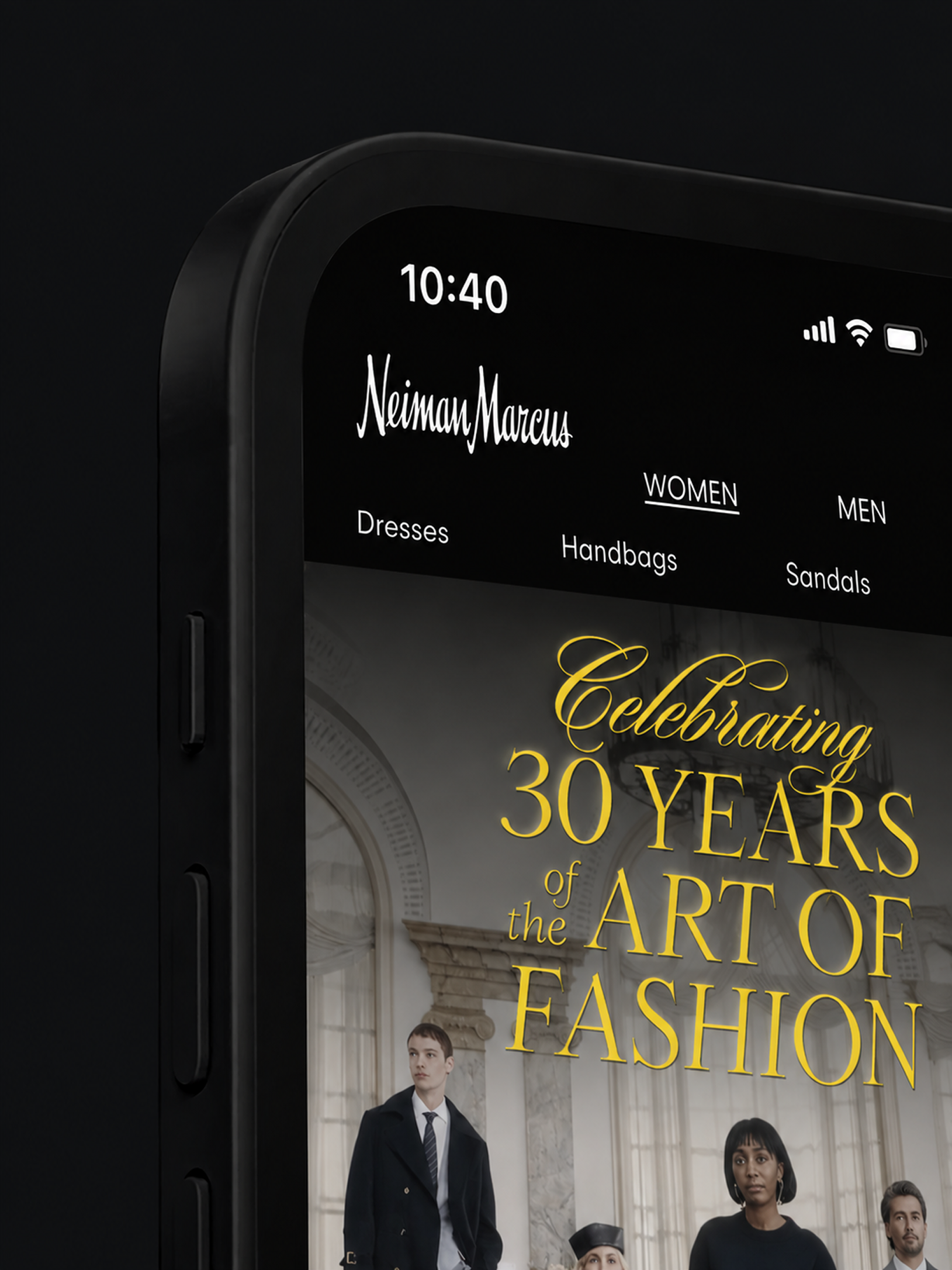
A physical boutique's taste and restraint, carried onto the phone rather than diluted for it.
Before redrawing a screen, I combined interviews with frequent and occasional shoppers, a competitive read of luxury retail apps, and an analytics review. Three break points surfaced: navigation was cumbersome — especially searching by designer; checkout was leaking to abandonment; and personalization was missing exactly where a luxury shopper treats it as a baseline, not a bonus. Each became a decision with an obvious version I turned down.
Discovery woven in, not bolted beside
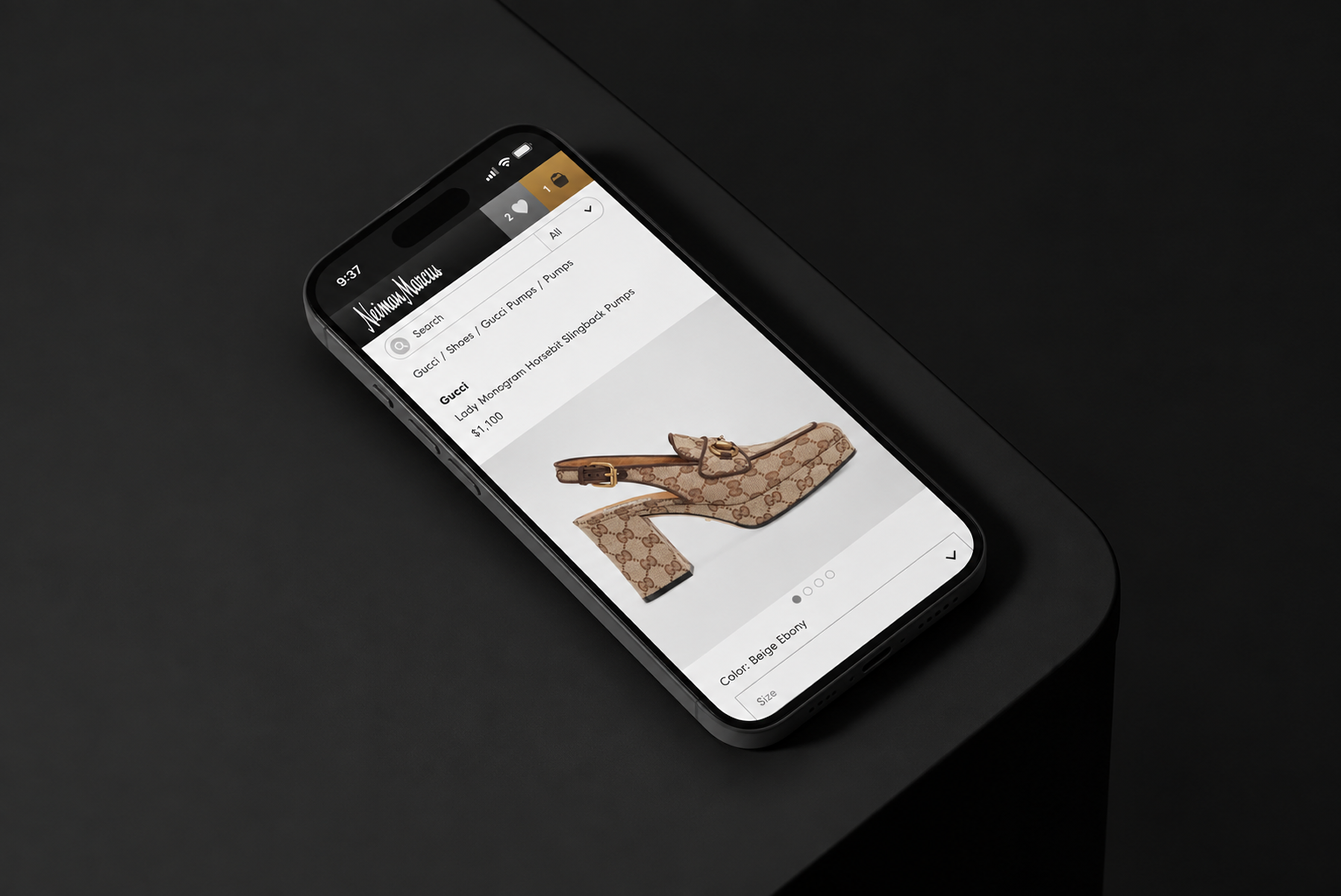
Bloomreach's intelligence could've lived where it usually does — a “Recommended for you” rail stapled beside the product. That's the widget, and it reads as the store guessing. I put the intelligence inside moments a shopper already trusts: Trending as a way in, and More Like This on the product page itself, where the “this, but…” instinct actually fires. Weaving it in had a cost — the recommendations now had to be good enough to stand in the primary flow, where a side rail would've forgiven mediocre ones. That's the bet the two standout numbers came from.
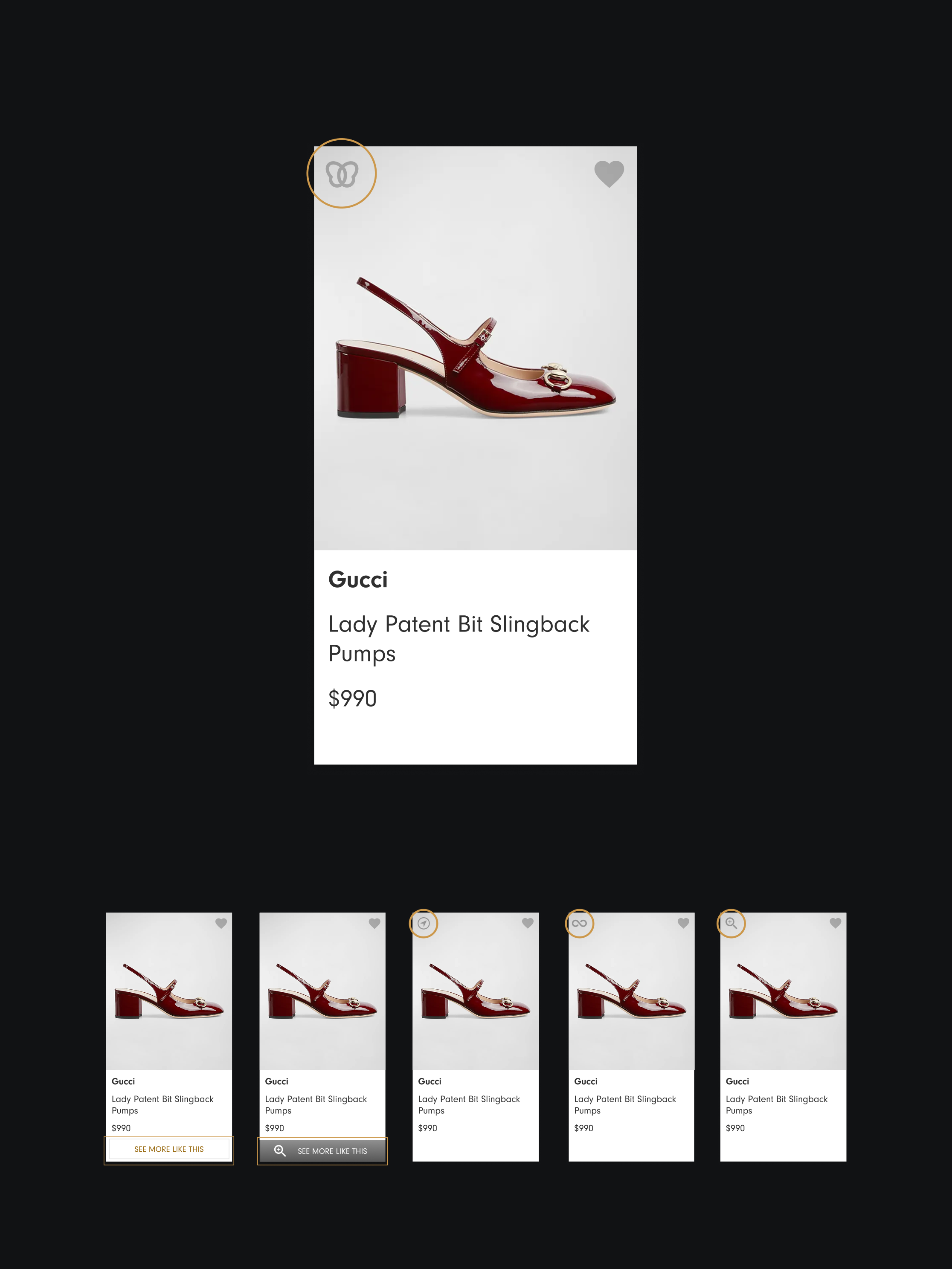
More Like This on the product page — discovery where the “this, but…” instinct fires, not a side rail.
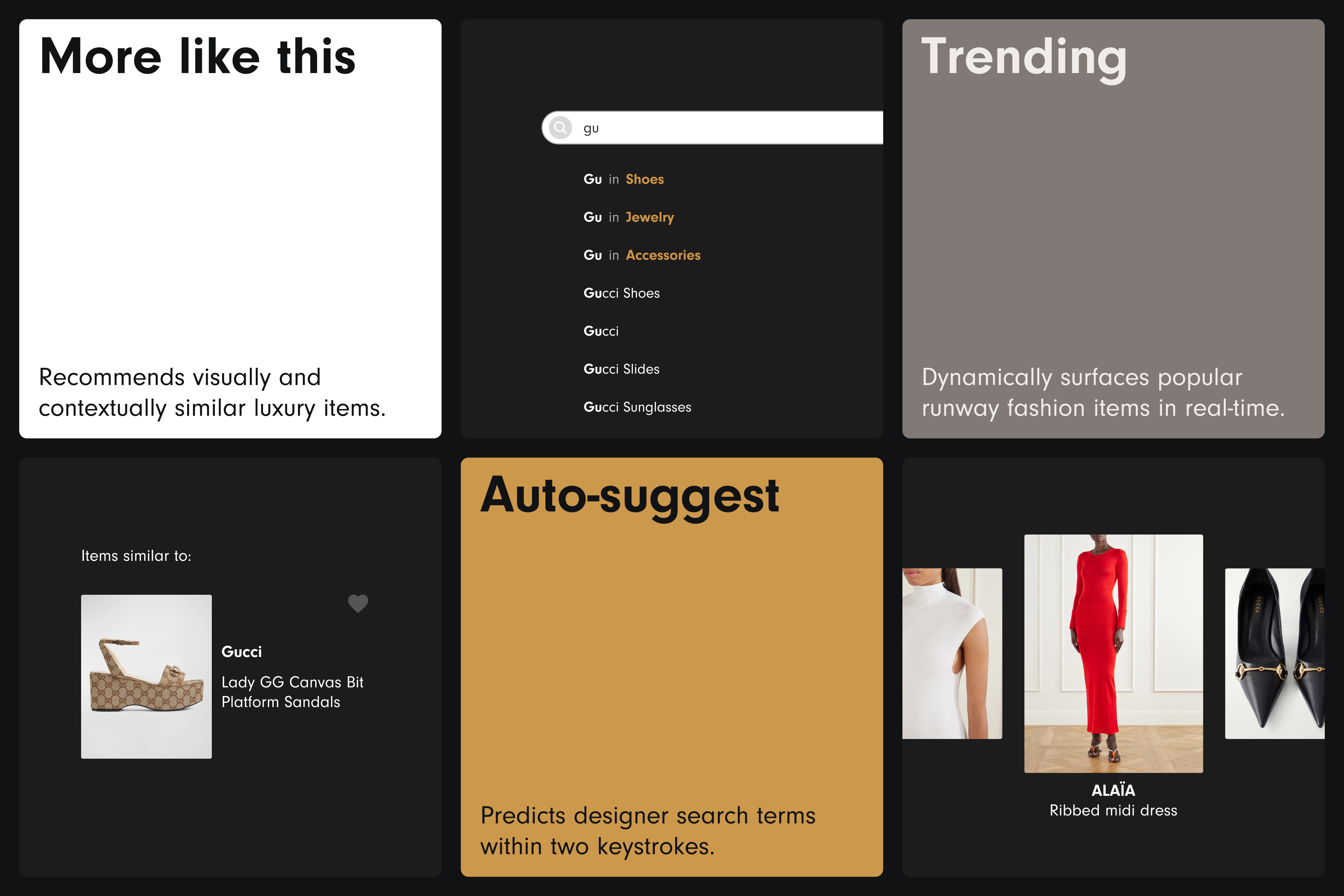
Search had to know designers, not just keywords
The obvious build is keyword search with filters bolted alongside. In luxury that fails the most valuable shopper — the one who arrives knowing the house, not the product: “Balenciaga,” not “black boot.” I made the designer a first-class part of search: predictive, brand-aware suggestions and filters that resolve as you type, so a designer-led query lands on a curated result instead of a keyword dump. The cost was a heavier search content model than a plain query needs — worth it, because “searching by designer” was the loudest single signal in the research.
Predictive, brand-aware suggestions that resolve as you type — a designer-led query lands on a curated result.
Trust lives in the transactional moments
The friction read is to shave steps. I treated abandonment as a trust problem first: a luxury buyer hesitates to hand card, address, or location to an app that feels thin. Guest checkout with no account wall and clear progress removed the friction — and the same restraint held through the most utilitarian screens, right down to asking for location only when Find in Store needs it and showing store availability plainly. Most apps let the brand collapse into a utility form here; holding it is where the doubt goes away.
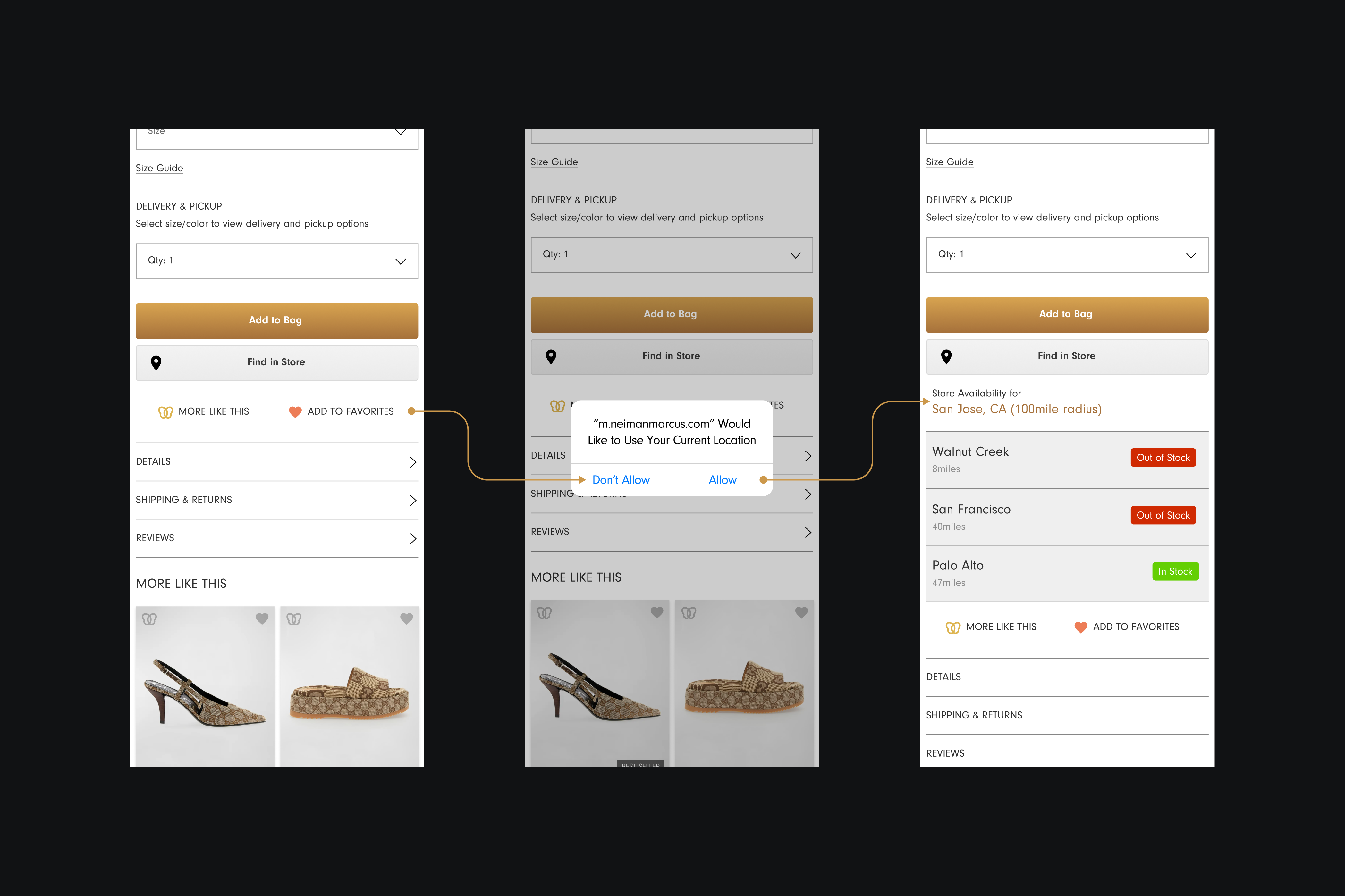
One system, boutique to bag
None of this holds without a system underneath it: a tight information architecture so nothing sits more than a couple of taps away, a restrained palette that reads as the store rather than a template, and a custom icon set drawn for the brand. The discipline is what lets the boutique feel survive the phone.
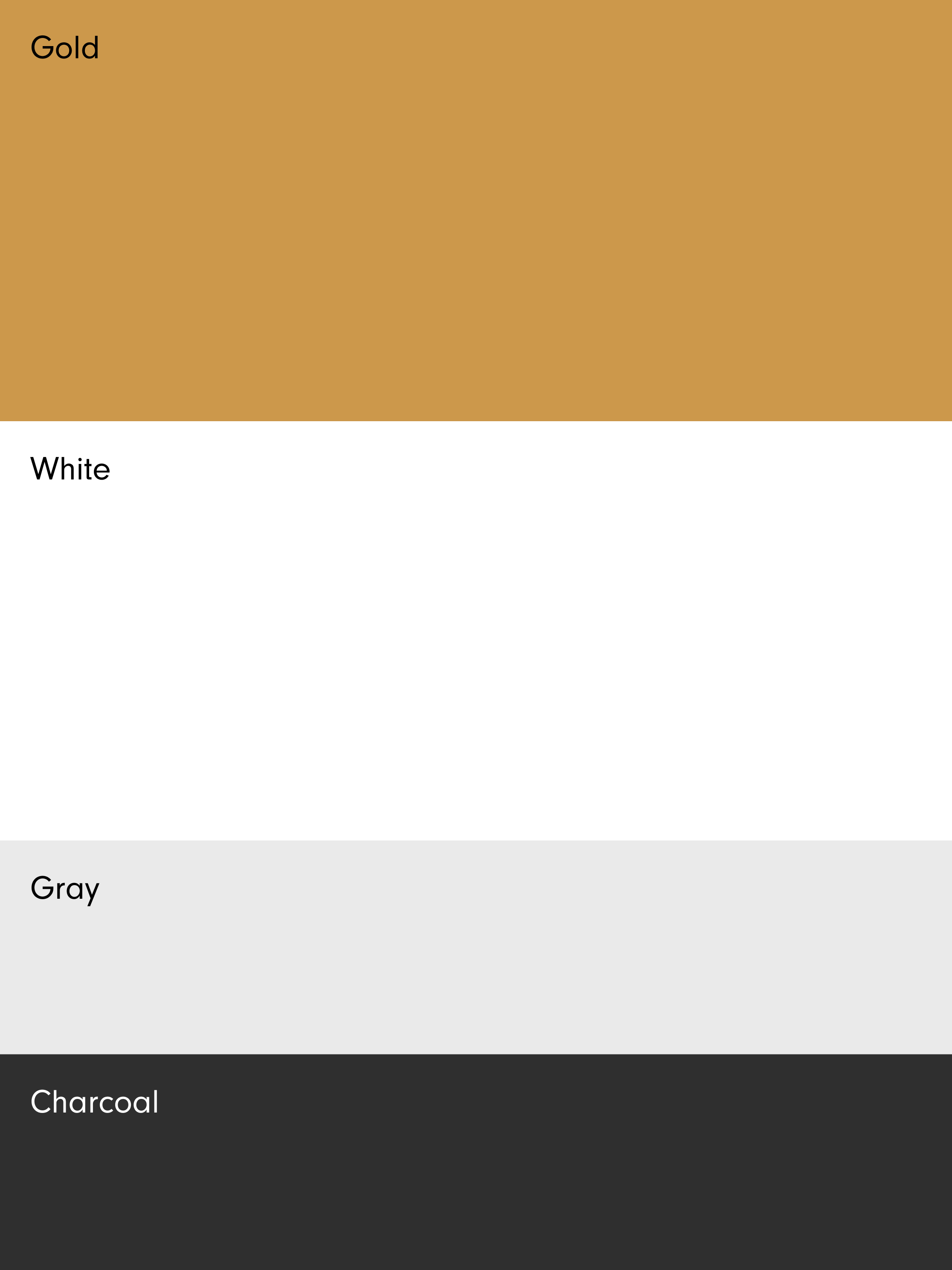
The whole experience mapped, and a restrained palette carrying the boutique feel onto the phone.
Impact
Each tracks a decision: designer-first search and woven discovery lifted product discovery 42%; treating checkout as a trust problem cut abandonment 28%; personalization in the moments shoppers trust raised engagement 35%.
Two feature-specific results, publicly reported from the period.
What the project taught me
Personalization usually ships as a widget, because a widget is easy to build and easy to point at. But in luxury it has to feel like a salesperson who already knows your taste, not the store guessing at you — which means the intelligence has to live inside the moments a shopper already trusts, and be good enough to stand in the main flow instead of hiding in a side rail. Get that right and a recommendation stops reading like an ad and starts reading like service.
Neiman Marcus case study