
BigCommerce
A shared design system for BigCommerce and Commerce, built so two brands could tell different stories from the same parts — without collapsing into one page.
BigCommerce needed to look like a credible alternative to Shopify and Salesforce. Its own marketing site looked like neither — fragmented layouts, a system too brittle to hold real enterprise content, and a story that leaked out through the gaps between pages.
The brief asked for consistency. The real job was almost the opposite: one system had to serve two brands — Commerce and BigCommerce — that shared content but not a look, where every page was being built from scratch, bespoke design and bespoke code. I needed just enough shared structure that the two could tell different stories and still read as built from the same parts.
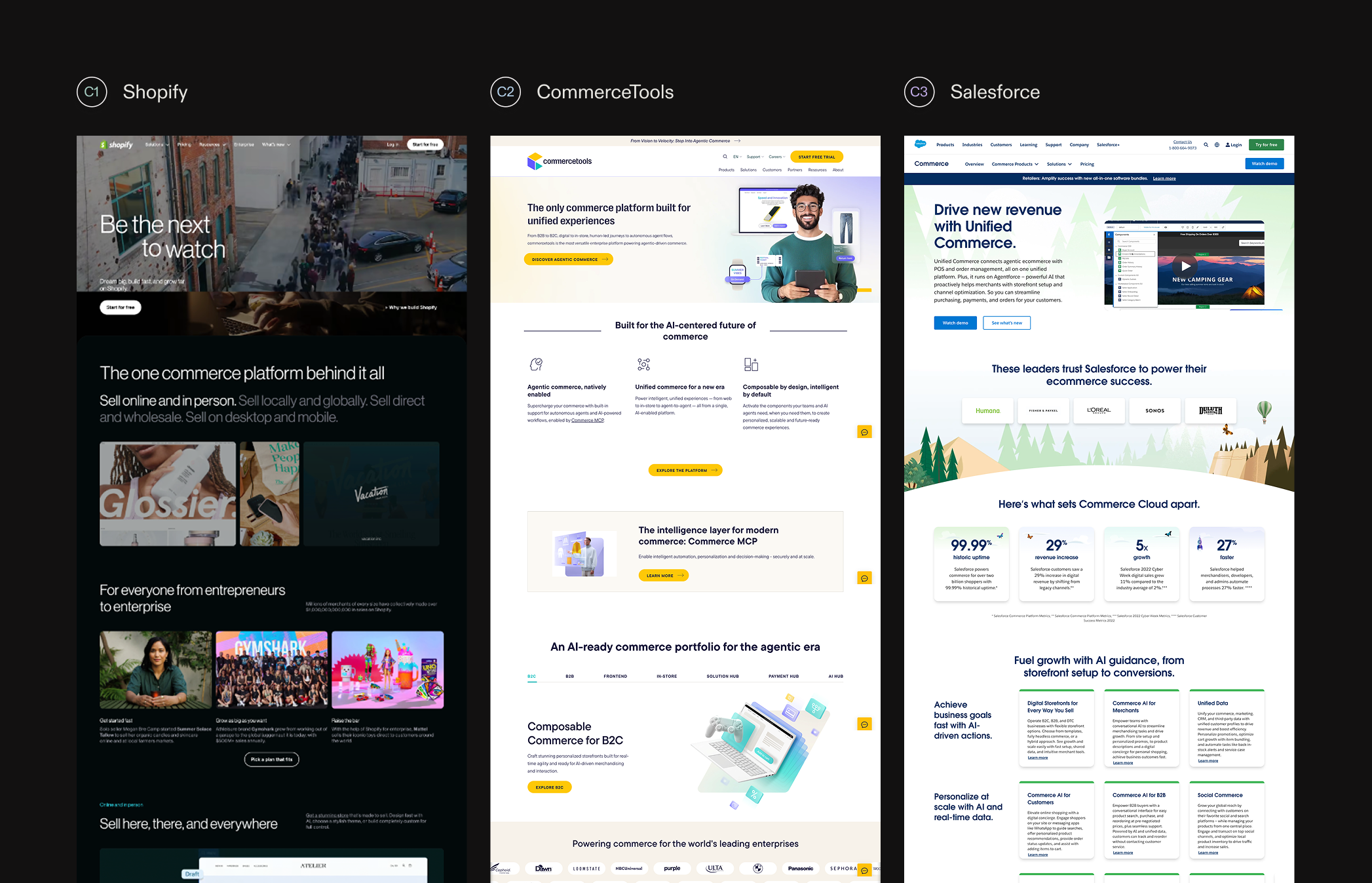
The site was quietly undercutting the product. Enterprise buyers sizing up a commerce platform were landing on inconsistent pages that couldn't carry the density their decisions actually need. Competitor research showed the opening — Shopify, CommerceTools, Adobe Commerce, and Salesforce all leaned on jargon and stock visuals. Clarity was there for the taking, but only if the system could deliver it on every page, not just the hero.
Before any layout, the two brands needed a shared language — a personality both could sit inside without either disappearing.
Brand-language exploration — the positioning and mood the one system had to flex across.
One system, two brands
Three ideas held it together — modularity, hierarchy, narrative — but a principle is just a poster until it costs you something. I led design under shared creative direction with Marshall Foster and Tim Debrandt, building in the Makeswift CMS, so every component had to survive being recomposed by marketers with me nowhere in the room.
Carousels let you cram several messages into one slot — and then hide most of them; they test as dead weight. I cut them from the homepage and gave it a single guided run, pain point to answer, carried by space and hierarchy instead of density. The cost is length: the page got taller and now leans on people scrolling. Scroll-triggered motion is what earns that scroll — it previews the product's breadth as you move instead of stacking another wall of text.
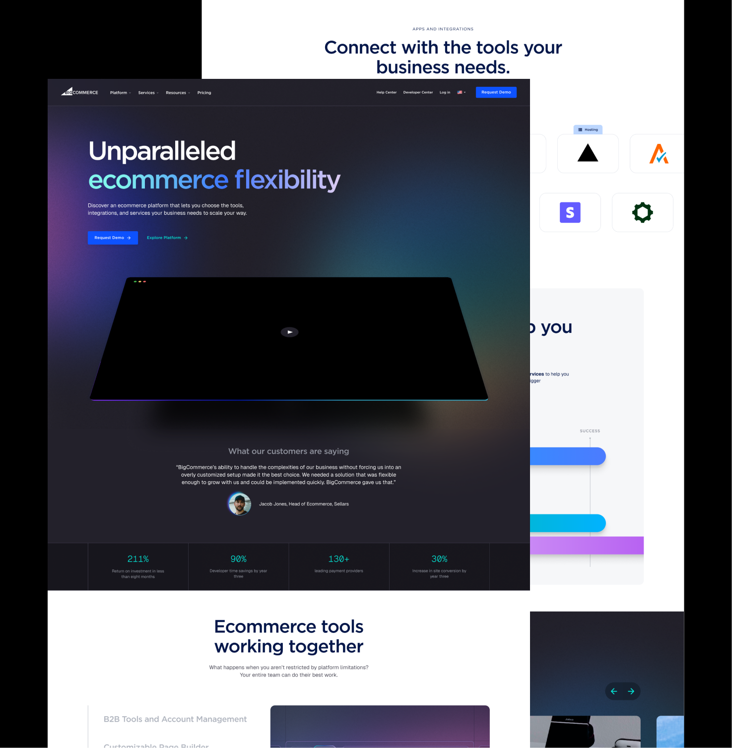

Rebuilt around proof points and clear calls to action, not a wall of features.
Shared parts beat two bespoke kits
The safe build was two tuned systems, one per brand — each a perfect fit, neither reusable. I built one instead: semantic color tokens, responsive type scales, and templates either brand could recompose. The trade-off is that no component is perfectly tailored to either brand; every part stays neutral enough to flex both ways. The bet was that shared parts, recombined, give you more range than two bespoke kits ever could — and that launching a page should feel like assembling it, not commissioning it.
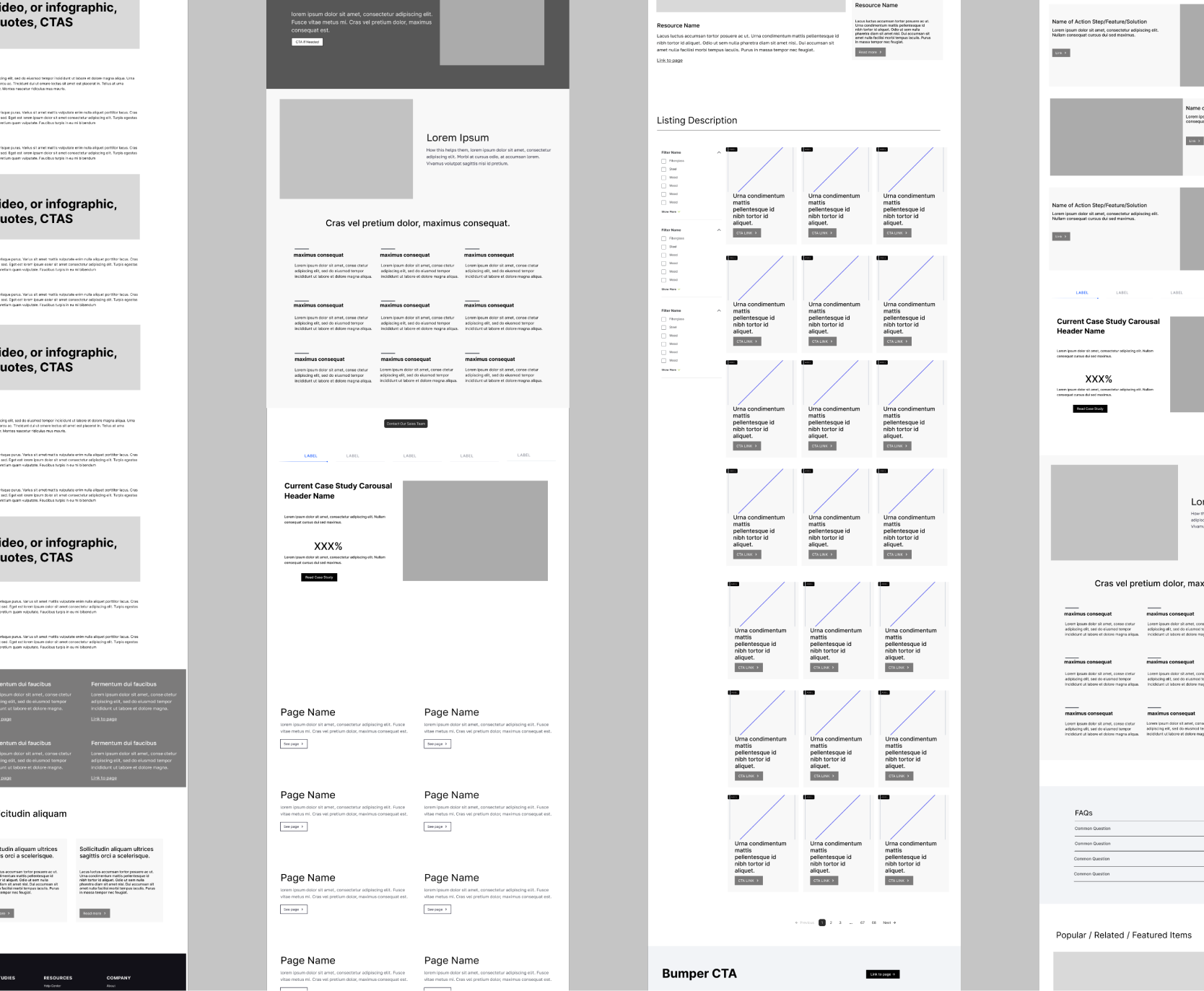
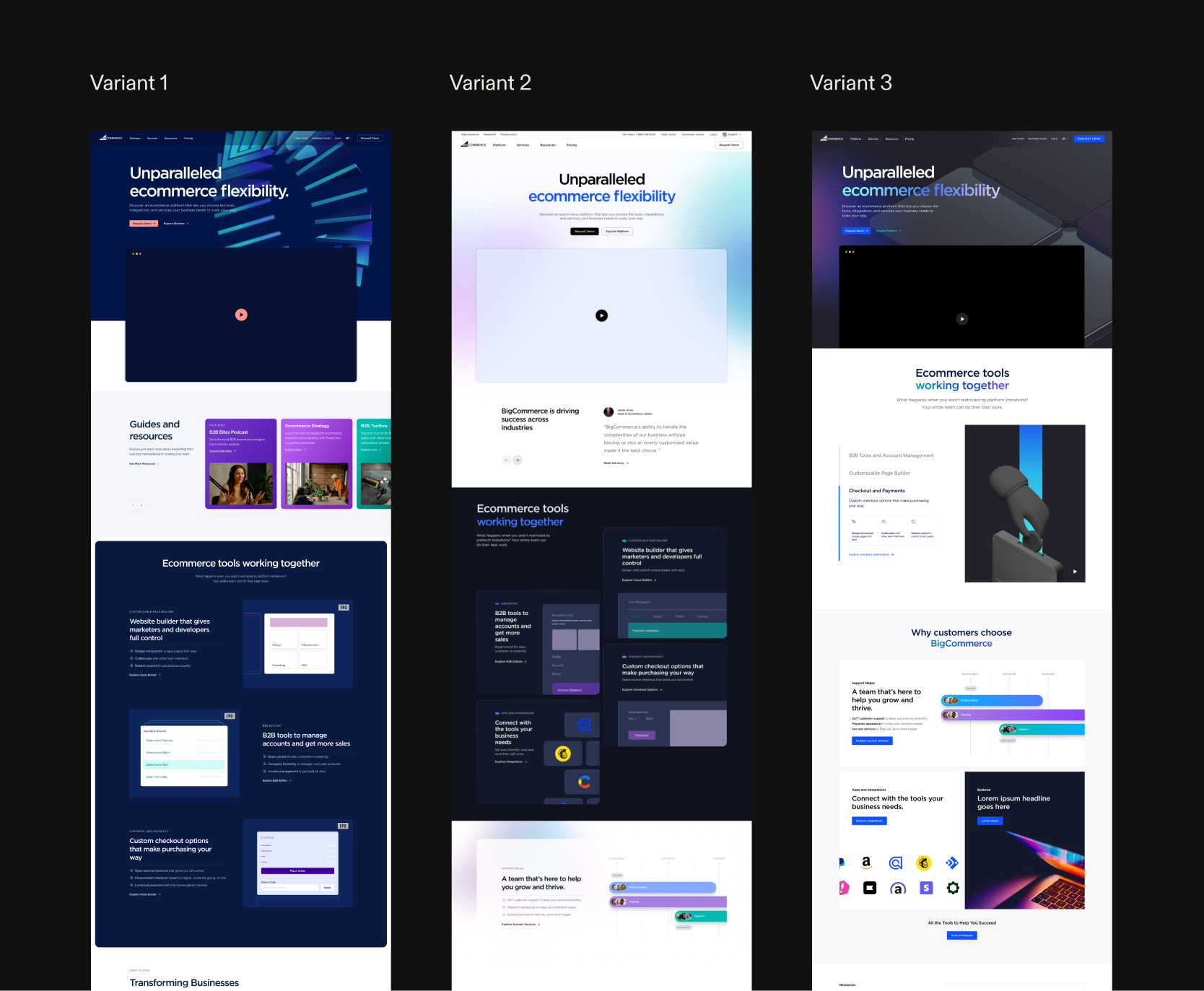
Wireframes first, then three homepage directions — structure settled before surface.
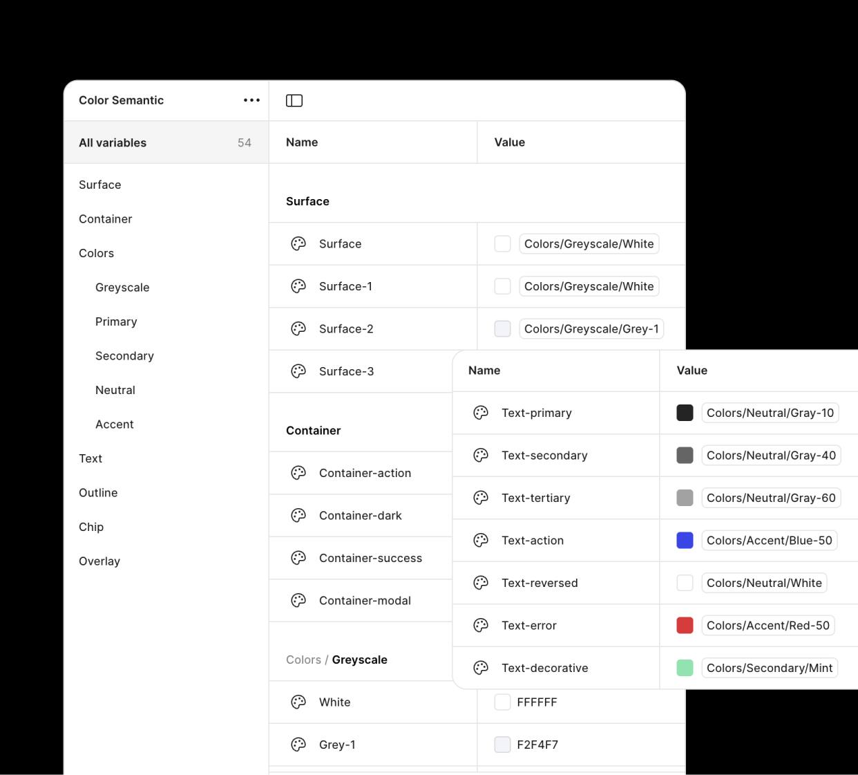
54 semantic variables mapped from raw values to roles — surface, text, container — so nothing on the page is a magic number.
Motion as argument, not decoration
Motion had to do work, not perform. The background system carries brand temperature from section to section; small moment-animations reward the scroll instead of interrupting it. Tuned per brand, the same rules read as two different personalities.
Gradients and fields tuned per brand — motion as argument, not ornament.
Small reveals that reward the scroll, and a brandmark that moves like the product.
Mobile, rebuilt not shrunk
The cheap path was reflowing the desktop layouts down to a phone. I rebuilt the hero treatments and key layouts for the small frame instead. It roughly doubled the design surface for those sections — but the first enterprise look increasingly happens on a phone, and a hero clearly built for that frame reads as competence there the same way it does on desktop.
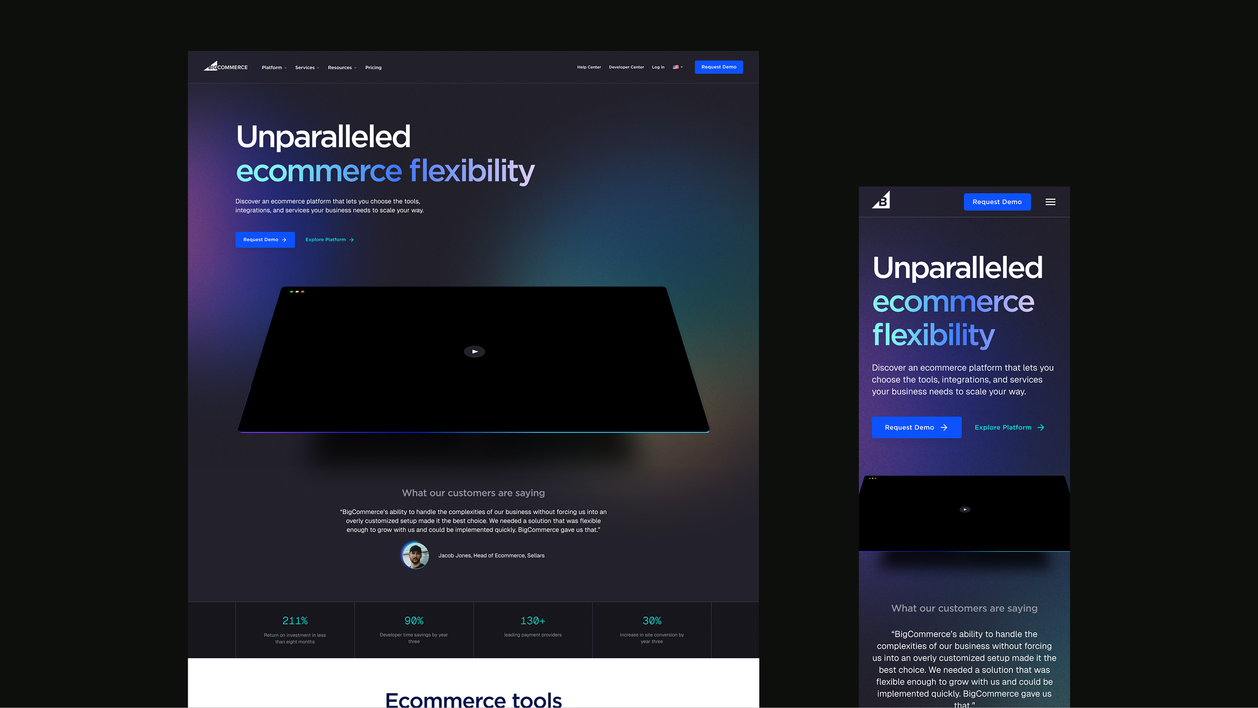
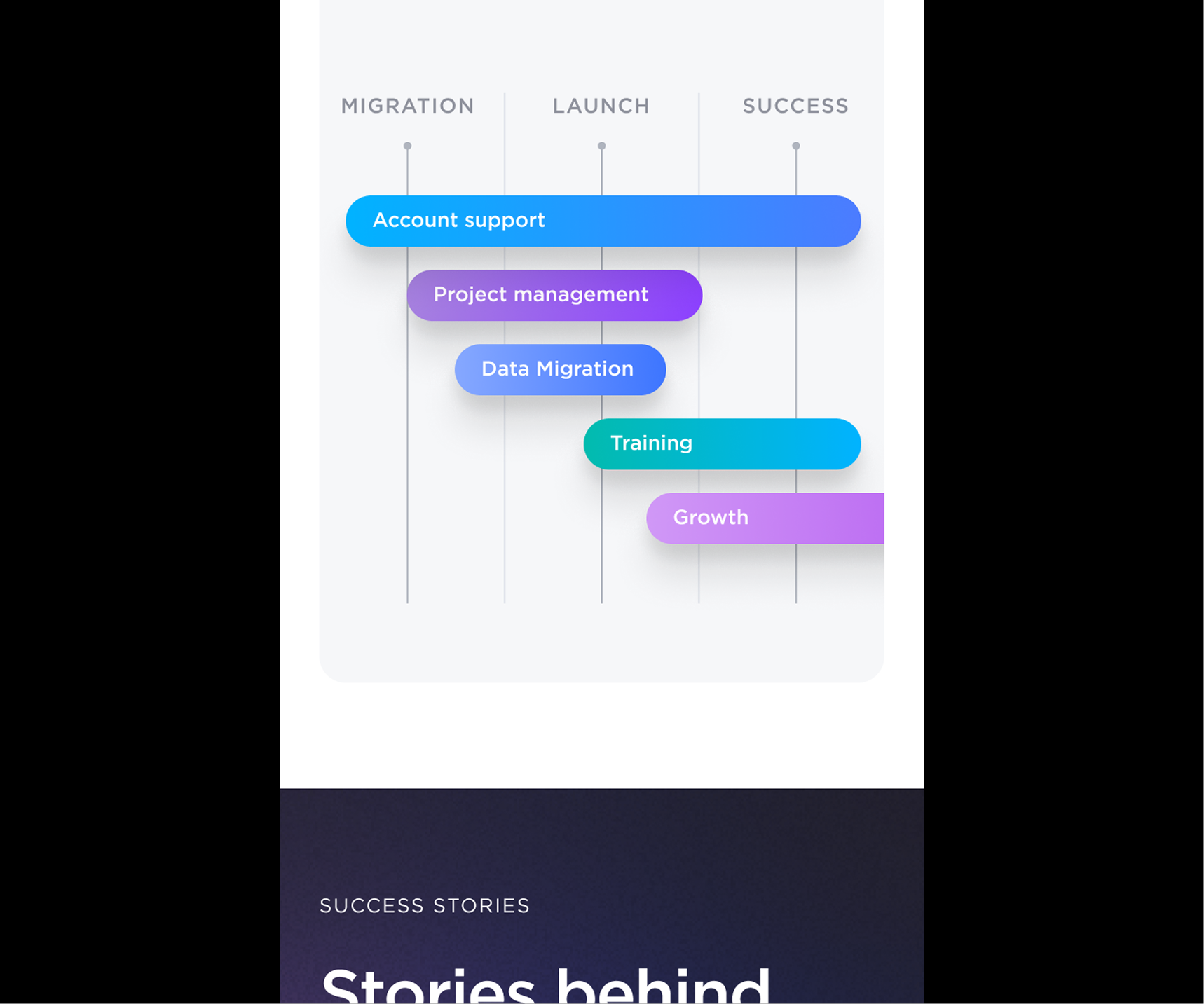
Migration through launch as one recomposable module — rebuilt for the small frame, not squeezed into it.
Handed off, not thrown over the wall
A system only holds if the people building on it can read it. I documented the grids, spacing, and component rules, then walked the team through the whole thing — so the parts kept meaning the same thing after I left the room.
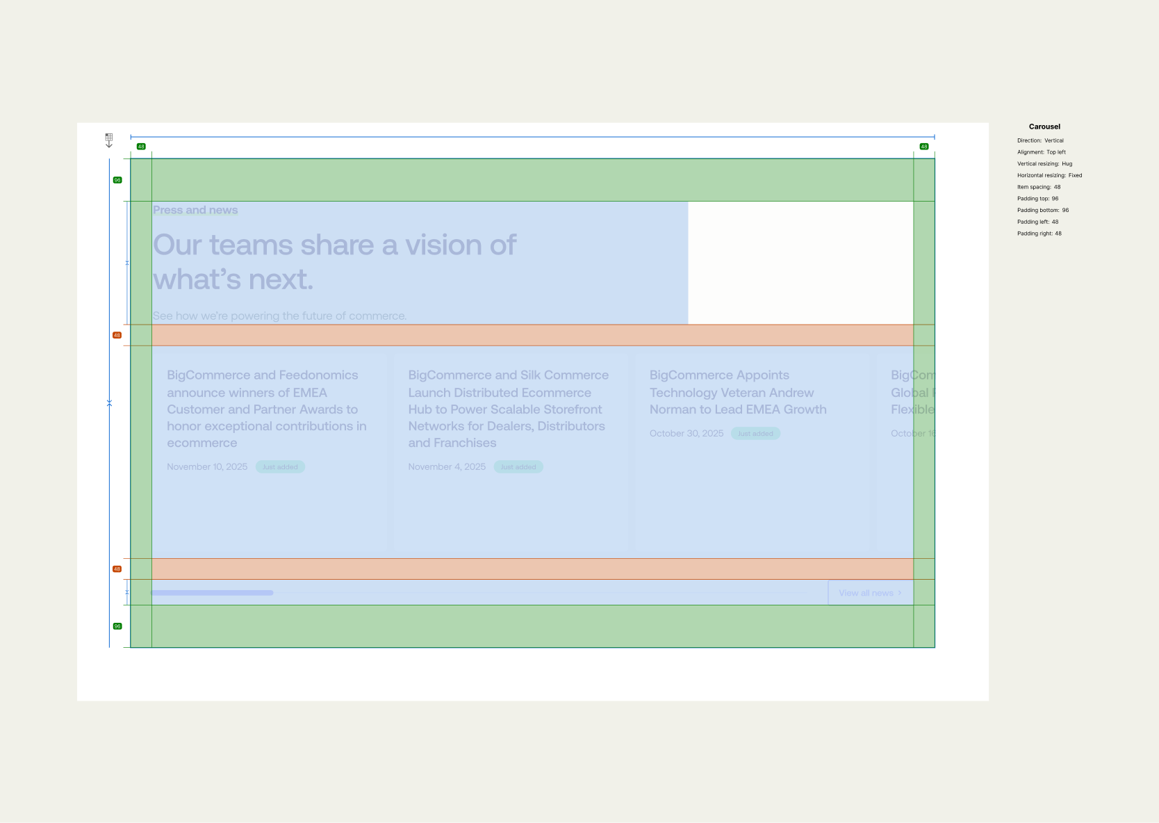
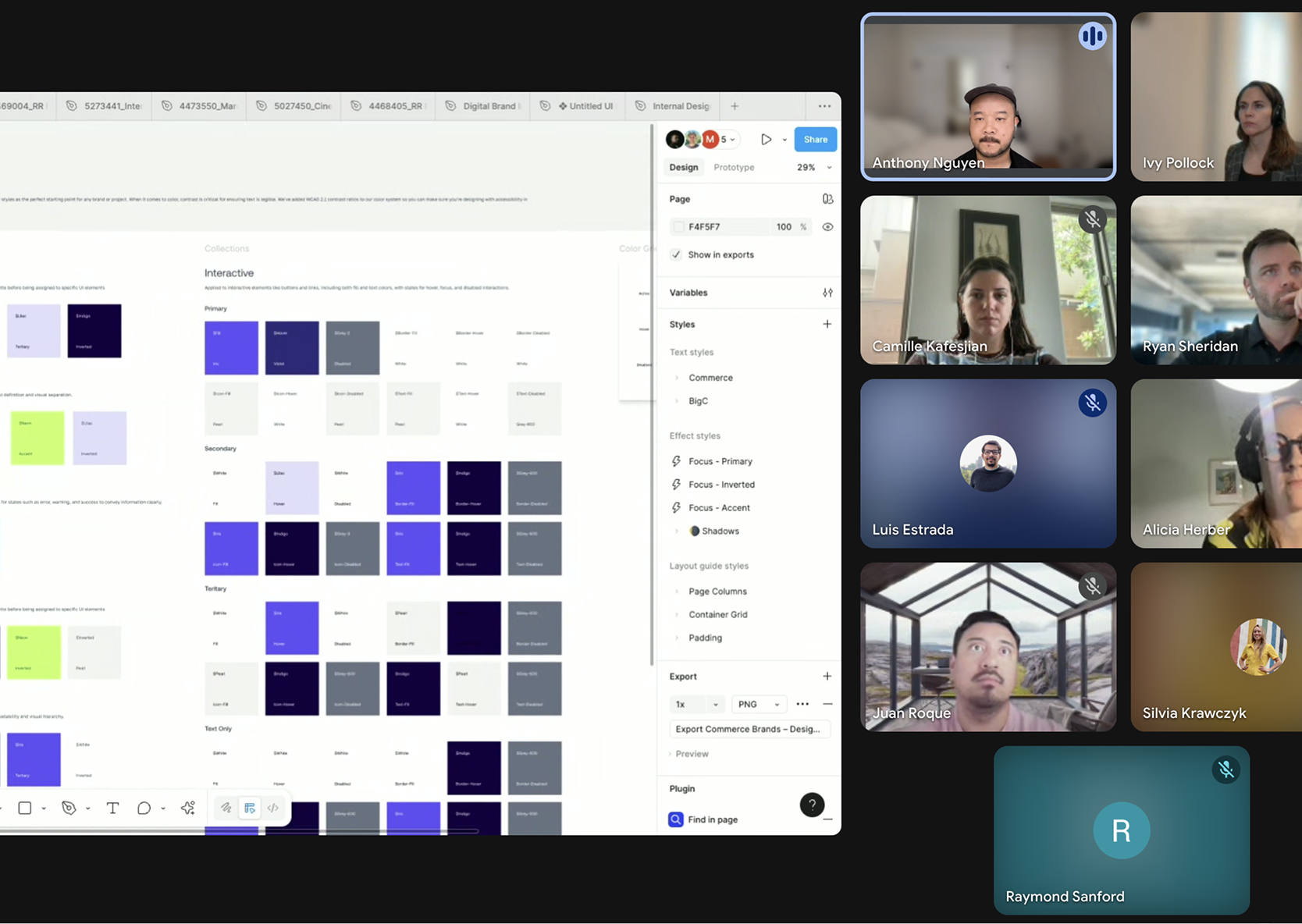
Grids, spacing, and component rules documented — then handed off in person, not over the wall.
Impact
One system behind both, shipped fast — and a site that finally read as credible as the platform it was selling.
What the system was really for
A design system doesn't prove itself by making every page identical. It proves itself by how much difference it can carry before a brand stops looking like itself. Two brands told different stories from the same parts, and neither blurred into the other — which was the whole point. Constraint and expression aren't opposites; the system is just what lets you afford the difference.
BigCommerce case study