Designing an Optimized Product Grid Editor with Bloomreach.
Brief
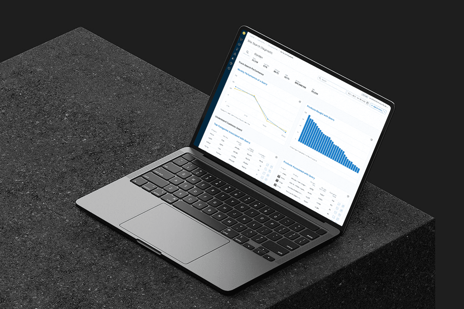
Bloomreach’s Product Grid Editor lets merchandisers fine-tune product results around campaigns and brand goals beyond just the algorithm. I helped simplify key actions like boosting, burying, and locking products, while also building a scalable design system to support future growth. Together, we made the tool more intuitive and flexible for merchandisers of all levels.
TEAM


Employer
Bloomreach
Timeline
Jul 2022 — Feb 2023
MY ROLES
The Challenge
Merchandisers face ongoing challenges balancing algorithm-driven optimization with their own business priorities, such as seasonal campaigns, product launches, or brand storytelling. The existing workflows in the Product Grid Editor were overly complex, making it difficult for users to efficiently create and manage rules for search queries and category pages. Key actions like boosting, burying, or locking products lacked clarity and often led to confusion, especially when multiple rules or external influences were in play. Additionally, without a unified design system, the interface suffered from inconsistencies, slowing down development and making it harder to deliver a cohesive experience across the platform. Simplifying these workflows while providing greater transparency and control was critical to improving both usability and scalability.
Approach
Simplifying the process of creating and previewing
Streamlined workflows and dynamic previews make it easier for users to create, test, and refine rules efficiently without technical expertise.
Ensuring rule clarity
Visual indicators and conflict resolution tools provide transparency, reducing errors and enabling seamless rule management.
Establishing a design system
A scalable design system ensures consistency, accelerates development, and supports intuitive user experiences across features and projects.


Research and Discovery
• Captured feedback from weekly customer success meetings to understand ongoing pain points and feature requests.
• Conducted usability testing with prototypes to validate and iterate on design concepts.
• Analyzed competitive tools where possible, although usability insights from competitors were limited.
Key Learnings
• What worked well: Iterative testing with end-users helped refine complex interactions into simple, intuitive workflows. The design system added significant value by improving consistency and scalability.
• Challenges: Balancing flexibility for power users with ease of use for less experienced merchandisers required careful prioritization. Building the design system required alignment across multiple teams.
• Competitor Insights: Although competitive analysis was limited, the focus remained on meeting user needs directly identified through feedback.
• Future Improvements: Continue expanding the design system with advanced components and patterns.